Assignment 4
Contents
Assignment 4#
Due Monday November 28, 2022 at 11:59pm PT on Gradescope.#
Download#
Problem 1#
This question relates to the below figure:
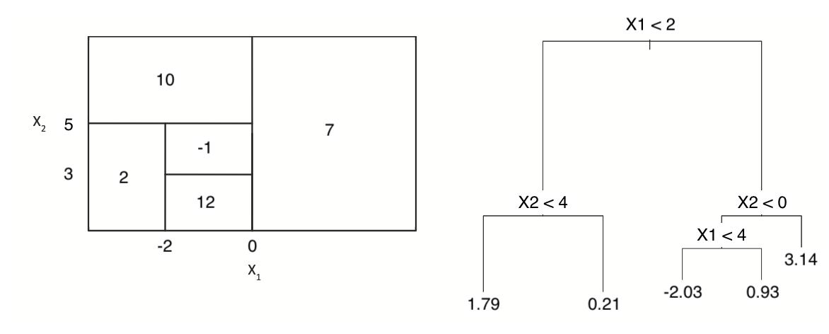
(a) Sketch the tree corresponding to the partition of the predictor space illustrated in the left-hand panel of the figure. The numbers inside the boxes indicate the mean of \(Y\) within each region.
(b) Create a diagram similar to the left-hand panel of the figure, using the tree illustrated in the right-hand panel of the same figure. You should divide up the predictor space into the correct regions, and indicate the mean for each region.
Problem 2#
In the lab, we applied random forests to the Boston data using mtry = 6 and using ntree = 25 and ntree = 500. Create a plot displaying the test error resulting from random forests on this data set for a more comprehensive range of values for mtry and ntree. You can model your plot after Figure 8.10 in the book. Describe the results obtained.
Problem 3#
We now use boosting to predict Salary in the Hitters data set.
(a) Remove the observations for whom the salary information is unknown, and then log-transform the salaries.
(b) Create a training set consisting of the first 200 observations, and a test set consisting of the remaining observations.
(c) Perform boosting on the training set with 1,000 trees for a range of values of the step size \(\lambda\). Produce a plot with different shrinkage values on the x-axis and the corresponding training set MSE on the y-axis.
(d) Produce a plot with different shrinkage values on the x-axis and the corresponding test set MSE on the y-axis.
(e) Compare the test MSE of boosting to the test MSE that results from applying random forests and from applying one of the regression approaches seen in Chapters 3 and 6.
(f) Which variables appear to be the most important predictors in the boosted model?
(g) Now apply bagging to the training set. What is the test set MSE for this approach?
Problem 4#
Apply boosting, bagging, random forests, and BART to a data set of your choice. Be sure to fit the models on a training set and to evaluate their performance on a test set. How accurate are the results compared to simple methods like linear or logistic regression? Which of these approaches yields the best performance?
Problem 5#
Suppose that we have four observations, for which we compute a dissimilarity matrix, given by
For instance, the dissimilarity between the first and second observations is 0.6, and the dissimilarity between the second and fourth observations is 0.35.
(a) On the basis of this dissimilarity matrix, sketch the dendrogram that results from hierarchically clustering these four observations using complete linkage. Be sure to indicate on the plot the height at which each fusion occurs, as well as the observations corresponding to each leaf in the dendrogram.
(b) Repeat (a), this time using single linkage clustering.
(c) Suppose that we cut the dendrogram obtained in (a) such that two clusters result. Which observations are in each cluster?
(d) Suppose that we cut the dendrogram obtained in (b) such that two clusters result. Which observations are in each cluster?
(e) It is mentioned in the chapter that at each fusion in the dendrogram, the position of the two clusters being fused can be swapped without changing the meaning of the dendrogram. Draw a dendrogram that is equivalent to the dendrogram in (a), for which two or more of the leaves are repositioned, but for which the meaning of the dendrogram is the same.
Problem 6#
In this problem, you will perform \(K\)-means clustering manually, with K = 2, on a small example with n = 6 observations and p = 2 features. The observations are as follows.
Obs |
X_1 |
X_2 |
|---|---|---|
1 |
2 |
5 |
2 |
0 |
3 |
3 |
1 |
6 |
4 |
4 |
2 |
5 |
1 |
4 |
6 |
5 |
2 |
(a) Plot the observations.
(b) Randomly assign a cluster label to each observation. You can use the sample() command in R to do this. Report the cluster labels for each observation.
(c) Compute the centroid for each cluster.
(d) Assign each observation to the centroid to which it is closest, in terms of Euclidean distance. Report the cluster labels for each observation.
(e) Repeat (c) and (d) until the answers obtained stop changing.
(f) In your plot from (a), color the observations according to the cluster labels obtained.
Problem 7#
In Section 12.2.3, a formula for calculating PVE was given in Equation 12.10. We also saw that the PVE can be obtained using the sdev output of the prcomp() function. You will simulate data, and calculate PVE in two ways.
To simulate data, create random normal data matrix of 50 observations and 4 variables using rnorm(). For grading purposes, please set the random seed to 1 (set.seed(1)).
(a) Using the sdev output of the prcomp() function, as was done in Section 12.2.3.
(b) By applying Equation 12.10 directly. That is, use the prcomp() function to compute the principal component loadings. Then, use those loadings in Equation 12.10 to obtain the PVE.
These two approaches should give the same results.
Hint: You will only obtain the same results in (a) and (b) if the same data is used in both cases. For instance, if in (a) you performed prcomp() using centered and scaled variables, then you must center and scale the variables before applying Equation 12.10 in (b).
Problem 8#
In this problem, you will generate simulated data, and then perform PCA and K-means clustering on the data.
(a) Generate a simulated data set with 25 observations in each of four classes (i.e. 100 observations total), and 50 variables.
Hint: There are a number of functions in R that you can use to generate data. One example is the rnorm() function; runif() is another option. Be sure to add a mean shift to the observations in each class so that there are three distinct classes.
(b) Perform PCA on the 100 observations and plot the first two principal component score vectors. Use a different color to indicate the observations in each of the three classes. If the four classes appear separated in this plot, then continue on to part (c). If not, then return to part (a) and modify the simulation so that there is greater separation between the four classes. Do not continue to part (c) until the four classes show at least some separation in the first two principal component score vectors.
(c) Perform K-means clustering of the observations with K = 4. How well do the clusters that you obtained in K-means clustering compare to the true class labels?
Hint: You can use the table() function in R to compare the true class labels to the class labels obtained by clustering. Be careful how you interpret the results: K-means clustering will arbitrarily number the clusters, so you cannot simply check whether the true class labels and clustering labels are the same.
(d) Perform K-means clustering with K = 3. Describe your results.
(e) Now perform K-means clustering with K = 5, and describe your results.
(f) Now perform K-means clustering with K = 4 on the first two principal component score vectors, rather than on the raw data. That is, perform K-means clustering on the 100x2 matrix of which the first column is the first principal component score vector, and the second column is the second principal component score vector. Comment on the results.
(g) Using the scale() function, perform K-means clustering with K = 4 on the data after scaling each variable to have standard deviation one. How do these results compare to those obtained in (b)? Explain.