Assignment #6: Dictionaries and Analyzing Data Bias
Due: 11:55pm (Pacific Time) on Tuesday, August 3rd
Based on problems by Colin Kincaid, Monica Anuforo, Jennie Yang, Nick Bowman, Chris Piech, Mehran Sahami, and Kathleen Creel.
This assignment will give you lots of practice with dictionaries and also show you how they can be used in combination with graphics to build your very own data visualization application. You can download the starter code for this project here. The starter project will provide Python files for you to write your programs in.
As usual, the assignment is broken up into warmups, and a larger prorgram. The warmups let you practice writing functions with dictionaries. The second part of the assignment is a longer program that uses dictionaries to store information about word count data from a dataset of reviews of professors from a popular website. Plotting and visualizing across professor gender and review quality reveals interesting trends about human language usage. We hope that you will be able to use this exercise in data visualization to also think critically about the underlying biases that exist in online datasets! The end product of this assignment is a complete application that will help you dig deep into our provided dataset while answering important social and ethical questions along the way.
Warm-up Exercises: Practice with Dictionaries
Here are some warmup problems to get started. The first couple are just regular list problems. Then dict-count and nested dict. The "previous" pattern on the last problem was discussed at the beginning of Wednesday's lecture.
> dict3hw
Turn In Turn In Warmups to Paperless
Main Program: Analyzing Data Bias
Introduction
In this assignment, you will use your nested data structure and graphics skills to build your very own data visualization application. You will analyze a historical dataset consisting of nearly 20 years of reviews of college and university professors posted on RateMyProfessors.com, a popular review aggregation website. Teacher ratings are a common and impactful facet of life in university – here at Stanford, we fill out course reviews at the end of every quarter. Future students use the results of these reviews to help them choose their classes and plan their academic futures. However, teaching evaluations are not an objective source of truth about the quality of a professor's teaching. Recent research has shown that teaching evaluations often demonstrate harmful biases, including gender bias. The bias in teaching evaluations is a problem because the scores are often used in decisions about who to hire, fire, tenure, and promote. Your goal is to build a piece of software that helps you investigate and reason about how humans use language in gendered (and potentially biased) ways. Here are two screen shots of the program you will build:
 Second when exploring the word "funny"
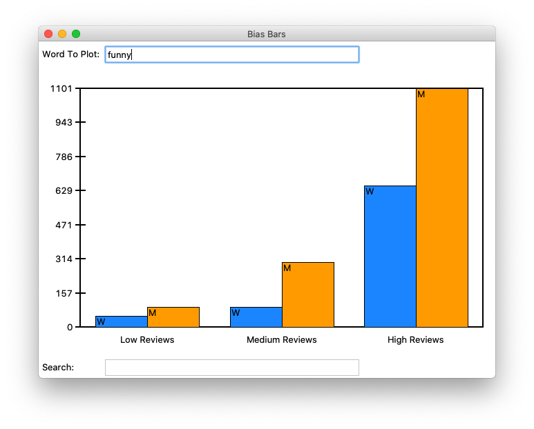
Before we get started coding, we first want to provide you with some background about why being able to investigate and identify biases in datasets is such an important problem to solve. Much of today’s work in artificial intelligence involves natural language processing, a field which studies the way language is used today and has been used in the past. The datasets we use to train artificially intelligent systems are usually collections of text that humans have written at some point in the past. If there are imbalances in how different groups of people tend to be described or represented in these datasets, then our machines will pick up on and potentially amplify those imbalances. Extreme manifestations of these biases like Tay, Microsoft’s 2016 chatbot infamous for tweeting racist and anti-Semitic statements after just a day of learning from anonymous posts on the Internet, magnify the importance of understanding the ways we use language. More recent examples include Amazon's AI tool for expediting hiring and recruiting, which was shut down after demonstrating extreme negative bias towards hiring candidates based on their gender.
Even when people do not mean to be malicious, their language can still exhibit biases that influence how our machines learn. For example, when history of science professor Londa Schiebinger attempted to Google Translate a Spanish article written about her, all of the pronouns became “he” and “him” rather than “she” and “her” simply because masculine pronouns were more common than feminine pronouns in the available data. In a later study, Schiebinger found more insidious translation errors that assumed genders for people of certain professions, based on the frequency of word usage in gendered languages such as German. The software engineers who made Google Translate probably did not mean for this to occur; they probably did not even account for that possibility as they were designing their translation algorithm. The moral of the story? To prevent these kinds of slip-ups, computer scientists need to consider the social impacts of their work at the beginning of their design process.
Identifying issues of bias and representation in datasets is a natural extension of many of the interesting ethical topics that we have talked about in CS106A so far this quarter. As we've mentioned before, our hope is that by introducing these sorts of topics early in computer science education, we can help the next generation of software developers and computer science researchers—which could include you!—be more mindful of the potential social implications of their work.
Assignment Overview
The rest of this handout will be broken into several sections. Each section defines a distinct, manageable milestone that will allow you to use the power of decomposition to build a complex final program out of many small, testable components.
- Understand the dataset (overview and data processing): Learn more about the dataset that you will be exploring and the format that it is provided to you in by calculating some baseline statistics on the dataset.
- Add data about a single word (data processing): Write a function for adding information about a single observed word in a review to a provided dictionary.
- Processing a whole file (data processing): Write a function for processing an entire data file of reviews and storing that data in a dictionary.
- Enabling search (data processing): Write a function to enable search through all words in the dataset.
- Run the provided graphics code (connecting the data to the graphics): Run the provided graphics code to ensure it interacts properly with your data processing code.
- Draw the background plot information (data visualization): Write a function that draws an initial plot area where the word frequency data will be displayed, and associated labels.
- Plot the word frequency data (data visualization): Write a function for plotting the data for an inputted word.
- Investigate bias in the dataset (ethics): Using your functional BiasBars application, explore the dataset to identify possible instances of biased/gendered use of language.
The work in this assignment is divided across two files: biasbarsdata.py for data processing and biasbars.py for data visualization. In biasbarsdata.py, you will write the code to build and populate the word_data dictionary for storing our data. In biasbars.py, you will write code to use the tkinter graphics library to build a powerful visualization of the data contained in word_data. We’ve divided the assignment this way so that you can get started on the data processing milestones (biasbarsdata.py) before worrying about graphics.
AN IMPORTANT NOTE ON TESTING:
The starter code provides empty function definitions for all of the specified milestones. For each problem, we give you specific guidelines on how to begin decomposing your solution. While you can add additional functions for decomposition, you should not change any of the function names or parameter requirements that we already provide to you in the starter code. Since we include doctests or other forms of testing for these pre-decomposed functions, editing the function headers can cause existing tests to fail. Additionally, we will be expecting the exact function definitions we have provided when we grade your code. Making any changes to these definitions will make it very difficult for us to grade your submission. Of course, we encourage you to write additional doctests for the functions in this assignment.
IMPLEMENTATION TIP:
We highly recommend reading over all of the parts of this assignment first to get a sense of what you’re being asked to do before you start coding. It’s much harder to write the program if you just implement each separate milestone without understanding how it fits into the larger picture (e.g. It’s difficult to understand why milestone 2 is asking you to add a word to a dictionary without understanding what the dictionary will be used for or where the data will come from).
Milestone 1: Understanding the dataset by calculating summary statistics
In this milestone you are going to write a program in the file rating_stats.py which will load the assignment data and calculate two numbers which summarize overall trends in the data.
This assignment uses real world data from RateMyProfessors.com, an online platform that enables students to leave anonymous, public reviews about their college/university professors. A typical review on RateMyProfessors.com consists of an overall numerical rating of quality (from 1-5), a number of qualitative tags (like "amazing lectures" or "difficult exams"), and a free-response comment section where students can write a short paragraph describing their experience with the professor. An example review for Mehran Sahami, a CS106A professor at Stanford, is shown below:
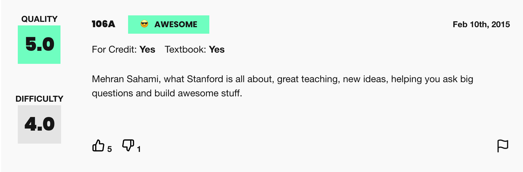 Figure 2. Example review from RateMyProfessors.com for Mehran Sahami
The power of the Internet makes this platform for reviews accessible to the global community of students, empowering students to make decisions about classes they might want to take or universities they might want to attend based on the quality of instruction. The indirectness and anonymity of being behind a computer or phone screen also gives people a sense of security to say whatever they want, which can range from the supportive or constructive to the downright offensive or harmful. In analyzing this dataset you will be working to answer the following question: does a professor's gender influence the language people use to describe them?
To examine this question, we have collected and compiled a dataset of 20,000 reviews from RateMyProfessors.com posted over a 17-year span from 2001 to 2018. We have cleaned and organized the data into one large text file that will act as the source of information for the program you will write. There are 3 important components of every review that we have used to build the dataset: gender of the professor being reviewed, textual content of the free-response comment, and overall review quality (a numerical score from 1-5).
Like many datasets that you will encounter in real life, the data is stored in a text file. Here is an example of what the data looks like:
data/small-handout.txt
Rating,Professor Gender,Comment Text
5.0,M,mehran sahami is what stanford is all about
4.5,W,she is a great professor and is very knowledgeable
1.0,M,terrible aim his candy throwing needs to improve
The files are included in the data folder of the project’s starter code (please note that since these files all live in the
data folder, you must specify their names as data/file-name.txt). You should note the following about the structure of each file:
- The first line of the file specifies the data format (to make the data files more human readable) and should be ignored when processing the actual data.
- All remaining lines in the file consist of three comma-separated values, as follows:
- The first value is the numerical rating of the review on a scale from 1.0 to 5.0, where 5.0 is the best review possible. Note that these ratings are represented as floating point numbers.
- The second value is the gender of the professor being reviewed, either M for Man or W for Woman.
- The third value in the line is the textual comment associated with the reviews. This comment consists of space-separated tokens that have been cleaned -- made all lowercase and stripped of punctuation.
A note on gender vs sex:
In this dataset, gender is the only piece of information we have about these people’s social identities; the dataset does not include other salient identities such as race and ability. Furthermore, gender is only classified into the categories of woman and man, which means non-binary people are unfortunately not represented. We choose to describe the two genders included in this dataset as “woman” and “man” rather than “female” and “male,” as the former terms refer to gender and social role whereas the latter typically refer to sex assigned at birth. Professors do not have the opportunity to describe their own gender identity; this data represents the guesses of students. We will reflect further on this point in the ethics questions at the end of the assignment.
Your first task is to write a program in the file rating_stats.py which loads the file "data/full-data.txt" and, using all the data in that file, calculates and prints two numbers:
- The percent of reviews for women which are rated high (the rating is greater than 3.5)
- The percent of reviews for men which are rated high (the rating is greater than 3.5)
> py rating_stats.py
Which data file would you like to load? data/full-data.txt
57% of reviews for women in the dataset are high.
58% of reviews for men in the dataset are high.
Recall that to calculate a percentage of reviews which are high for a given gender you should divide the count of the number of reviews which are both for that gender and high by the count of the number of reviews for that gender. Then, to turn this decimal into a percent, first multiply by 100 and then convert to an integer using the round() function. The round() function is a handy Python function that will round a floating point value to the nearest integer, allowing us to produce the nice output format we want.
Without getting into the math too deeply we note that given the amount of data we have access to, any number you calculate is likely to deviate by 1 to 2 percentage points.
Note that the user has specified the path to the data file including the directory data, since the file full-data.txt is in the data subdirectory of the project folder.
Also note that you can use the next() function of a file object (as in next(file) if you just want to read a single line from a file. This might be helpful to read the first (header) line of the file before then going into a loop to read all the lines of actual data in the file.
Milestone 2: Building the word_data variable needed for our data visualization
In this milestone you are going to program two functions necessary to build the word_data data structure: add_data_for_word and convert_rating_to_index. Both functions are in biasbarsdata.py.
Data in the real world is rarely in the form you need it to be. In this case, we want to make a data visualization of bias bars, but we only have data in a text file broken down by individual reviews. There’s a problem with this; the interesting analysis and visualization of the data described above requires organizing our data by word. This is a realistic data problem, and it will be the main challenge for this project. Our goal in the first three milestones will be to build an overall word_data dictionary that contains the sums of individual frequencies for a given word across many years, broken down by gender and rating quality.
Effectively structuring data
In order to help you with the challenge of structuring and organizing the word count data that must be calculated across many different individual reviews, we will define a nested data structure as well as some key assumptions regarding how we interpret the data.
To begin with, we need to consider the issue of being able to organize the data by the numerical rating associated with the review, since we want to be able to identify trends in how a given word is used in positive reviews vs. negative reviews. Since numerical rating is a float (real value) that can take on many different values between 1.0 and 5.0, we are going to make our data processing task simpler by representing review quality using only three "buckets":
- Reviews with a numerical rating of less than 2.5 will be considered "low reviews".
- Reviews with a numerical rating between 2.5 and 3.5 (inclusive on both ends of range) will be considered "medium reviews"
- Reviews with a numerical rating above 3.5 will be considered "high reviews"
With this knowledge, let's think about how we can build a data structure that organizes word frequencies (counts) across both gender and review quality. The data structure for this program (which we will refer to as word_data) is a dictionary that has a key for every word (a string) that we come across in the dataset. The value associated with each word is another (nested) dictionary, which maps gender to a list of word counts, broken down by rating quality (the ordering is counts for low reviews, then medium reviews, then high reviews). A partial example of this data structure would look something like this:
        {
            'great': {
                'W': [30, 100, 800],
                'M': [100, 200, 1500]
            },
            'teacher': {
                'W': [330, 170, 852],
                'M': [402, 250, 1194]
            }
        }
As mentioned previously, each word has an inner dictionary storing information about frequencies aggregated by gender. We have provided you with helpful constants KEY_WOMEN ("W") and KEY_MEN ("M") that represent the key values of the inner nested dictionary.
Let's break down the organization of this data structure a little bit with an example. Let's say we wanted to access the current count of occurrences of the word "great" in high reviews for women (which we can see to be 800 from the above diagram) . What steps could we take in our code to traverse the nested data structure to access that value?
- First, we must access the overall
word_datadictionary to get the data associated with the word "great" using the expressionword_data["great"]. This gives us an inner dictionary that looks like this{ 'W': [30, 100, 800], 'M': [100, 200, 1500] } - Now, we must access the list of word counts associated with our gender of interest. To do that, we can use another level of dictionary access, now specifying the dictionary key for women, with the expression
word_data["great"]["W"]. This expression gives us the following list[30, 100, 800] - Finally, we're one step away from our end goal. The last step is to index into the innermost list to get the word count associated with the specific review bucket we want to analyze. We know that high reviews fall in the last bucket of our list (index 2), so we access our overall desired count with the expression
word_data["great"]["W"][2]which finally gives us the desired count of800.
As a debugging tool, we've provided a helpful print_words() function that takes in a word_data dictionary of exactly this format and prints out its contents, with the data displayed in alphabetical order by word. We handle all of the printing of word_data for you so you are not required to sort the keys in the outer dictionary alphabetically. But if you’re interested in seeing how it works, feel free to check out the provided function!
The subsequent milestones and functions will allow us to build, populate, and display our nested dictionary data structure, which we will refer to as word_data throughout the handout. They are broken down into two main parts: data processing in biasbarsdata.py (milestones 2-4) and data visualization in biasbars.py (milestones 5-7).
The add_data_for_word() function takes in the word_data dictionary, a single word, a gender label, and a numerical rating for the review in which this word was observed. The function then stores this information in the word_data dict. Eventually, we will call this function many times to build up the whole data set, but for now we will focus on just being able to add a single entry to our dictionary, as demonstrated in different stages in Figure 4. This function is short but dense.
add_data_for_word(word_data, "class", "W", 4.5){
}
{
    "class": {
        "W": [0, 0, 1],
        "M": [0, 0, 0]
    }
}
add_data_for_word(word_data, "class", "M", 1.5){
"class": {
"W": [0, 0, 1],
"M": [0, 0, 0]
}
}
{
    "class": {
        "W": [0, 0, 1],
        "M": [1, 0, 0]
    }
}
add_data_for_word(word_data, "class", "W", 5.0){
"class": {
"W": [0, 0, 1],
"M": [1, 0, 0]
}
}
{
    "class": {
        "W": [0, 0, 2],
        "M": [1, 0, 0]
    }
}
Figure 4. The dictionary on the left side of the arrow represents the word_data dict passed into the add_data_for_word() function. The dictionary on the right side of the arrow represents the word_data dictionary after a call to the function has been made with the specified parameters. The result of three separate function calls are diagrammed here.
Note that since dictionaries in Python are mutable, when we modify the word_data dictionary inside our function, those changes will persist even after the function finishes. Therefore, we do not need to return the word_data dictionary at the end of add_data_for_word().
Here's three important things you should take into consideration when implementing this function:
- When you first encounter a word that doesn't yet exist in the dictionary, you should insert a "default value" inner dictionary into the list. This dictionary should have keys for both women and men present and inner list values for both that are length-3 lists with the values all set to 0. An example declaration of the inner dict you might insert would look as follows:
Why is insertion of this default dictionary important when you encounter a word that doesn't yet exist at the outer level of thedefault_dict = { KEY_WOMEN: [0, 0, 0], KEY_MEN: [0, 0, 0] }word_datadictionary? Well, once you know there is such a structure available for your word of interest, then you can safely index into the nested structure at each level (word, gender, and rating index). - When you encounter a word that already exists in the dictionary, you should increment the existing count associated with the provided word, gender, and rating, therefore building up a cumulative total of word count data over time! Hint: Go back to the example in the "Effectively structuring data" section. How can we access internal counts in the nested data structure in Python code?
- We've provided a skeleton of a helper function called
convert_rating_to_index()that we strongly recommend implementing (there's even associated doctests provided!). The goal of this function is to take the numerical review provided to the function and translate that rating into a "bucket" index, which will help you figure out which internal list entry to increment. Remember, we have three buckets (low rating, medium rating, and high ratings) and the conversion rules are as follows:- Rating that are less than 2.5 fall in the low bucket (index 0)
- Ratings that are between 2.5 and 3.5 (inclusive) fall in the medium bucket (index 1)
- Ratings that are greater than 3.5 fall in the high bucket (index 2)
Testing Milestone 2
The starter code includes a couple of doctests to help you test your code. The tests pass in an empty dictionary to represent an empty word_data structure. You will want to consider writing additional doctests for add_data_for_word() to help you make sure this function is working correctly before moving on. Take a look at how the existing doctests are formatted. As we mentioned in class, writing doctests is just like running each line of code in the Python Console. Therefore, you will first need to create a dictionary on one doctest line before passing it into your function. As you can see in the existing doctests for this function, we start with an empty dictionary, then call the add_data_for_word() function (with appropriate parameters) to add entries to the word_data dictionary. Then, we put word_data on the final doctest line, followed by the expected contents in order to evaluate your function. We have modeled this 3-step process for you in the doctests that we have provided to encourage you to create additional doctests. You do not necessarily need to create a new dictionary for every doctest you might add. If you do add additional doctests, make sure to match the spacing and formatting for dictionaries (as in the examples we have provided), including a single space after each colon and each comma. The keys should be written in the order they were inserted into the dict – this means that when you declare the "empty" inner dictionary described above, you should always specify the key for women first and the key for men second, otherwise the provided doctests won't pass.
Milestone 3: Processing a whole file of review data
In this milestone you are going to program the workhorse function necessary to build the word_data variable: read_file.This function is in biasbarsdata.py
Now that we can add a single entry to our data structure, we will focus on being able to build a whole file’s worth of professor reviews. Fill in the read_file() function, which takes in a filename and returns a word_data dict storing all of the word count data from that file. You should add the contents of the file, one line at a time, leveraging the add_data_for_word() function we wrote in the previous milestone. The format of a text file containing professor review data is shown in Figure 3 and is described in detail in the "Dataset Overview" overview section. Here is a short summary of the important details:
- The first line of every file contains a set of strings describing the format of the data structure. Make sure to ignore this line when processing the contents of the file.
- Each line represents a single review and is composed of three comma-separated values. The first value is a numerical rating, the second value is a string describing the professor's gender, and the third value is a string representing the textual comment left as part of the review. Hint: the
split()function will be useful here. - The textual comment consists of many word tokens, each separated by spaces. Hint: the
split()operation will be useful here as well! After splitting the comment into words, you should be able to make use of theadd_data_for_word()function you implemented in Milestone 2.
word_data dictionary at the end of the function. Tests are provided for this function, using the relatively small test files small-one.txt, small-two.txt, and small-three.txt to build a rudimentary word_data dictionary.
Milestone 4: Searching for words in the dataset
In this milestone you are going to implement search_words(), a neat little function to help sort through all the data stored in the word_data dict. This function is in biasbarsdata.py
Now that we have a data structure that stores lots of word count data, organized by word, it might be good to be able to search through all the words in our dataset and return all those that we might potentially be interested in. You should write the search_words() function, which is given a word_data dictionary and a target string, and returns a list of all words from our dataset that contain the target string. This search should be case insensitive, which means that the target strings 'le' and 'LE' both match the word 'lecture'. Note that the words that contain the target string anywhere in them (not just at the beginning) should also be returned by this function. So the word 'middle' will also match the target string 'le'.
Testing Milestones 2-4
You’ve made it halfway! It’s now time to test all the functions you’ve written above with some real data and then move on to crafting a display for the data. We have provided a main() function in biasbarsdata.py for you to be able to test that all of the functions we’ve written so far are working properly. Perhaps more importantly, you’ll be able to flex your new data organization skills on the large dataset over 20,000 real reviews from RateMyProfessor.com! The given main() function we have provided can be run in two different ways. The first way that your program can be run is by providing a single data file argument, which will be passed into the read_file() function you have written. This data is then printed to the console by the print_words() function we have provided, which prints the words in alphabetical order, along with their associated word count data. A sample output can be seen below, when running the biasbarsdata.py program on the small-three.txt file. This file is just for testing purposes and doesn't actually contain any real data. (Note: if you're using a Mac, you would use "python3" rather than "py" in the examples below.)
> py biasbarsdata.py data/small-three.txt
average M [1, 3, 0] W [0, 0, 0]
best M [1, 0, 0] W [0, 0, 3]
not M [2, 0, 0] W [0, 0, 0]
The small files test that the code is working correctly, but they’re just an appetizer to the main course, which is running your code on the file containing the real reviews! You can take a look at almost 20 years of data with the following command in the terminal (pro tip: you can use the Tab key to complete file names).
> py biasbarsdata.py data/full-data.txt
… lots of output …
Organizing all the data and dumping it out is impressive, but it’s not the only thing we can do! The main() function that we have provided can also call the search_words() function we have written to help us filter the large amounts of data we are now able to read and store. If the first 2 command line arguments are "-search target", then main() reads in all the data from the specified file, calls your search_words() function to find words that have matches with the target string, and prints those words. Since the main() function directly prints the output of the search_words() function, note that the words are not printed in alphabetical order, but rather in the order in which they were added to the dictionary. Here is an example with the search target "pand":
> py biasbarsdata.py -search pand data/full-data.txt
expanded
expand
expanding
mind-expanding
pandered
expands
pandering
pander
You've now solved the key challenge of reading and organizing a realistic mass of data! Now we can move on to building a cool visualization for this data!
Milestone 5: Running the provided graphics code
In this milestone you are going to investigate the skeleton of the provided graphics program we've given you and confirm it correctly ties in with your code from the previous four milestones.There is no code to write here but you will be running code from biasbars.py
We have provided some starter code in the biasbars.py file to set up a drawing canvas (using tkinter), and then add the interactive capability to enter words to plot and target strings to search the words in the database. The code we have provided is located across two files: the tkinter code to draw the main graphical window and set up the interactive capability is located in biasbarsgui.py and the code that actually makes everything run is located in the main() function in biasbars.py. The provided main() function takes care of calling your biasbarsdata.read_file() function to read in the data files full of reviews and populate the word_data dictionary. The challenge of this part of the assignment is figuring out how to write functions to graph the contents of the word_data dictionary. For this milestone, you should run the program from the command line in the usual way (shown below).
> py biasbars.py
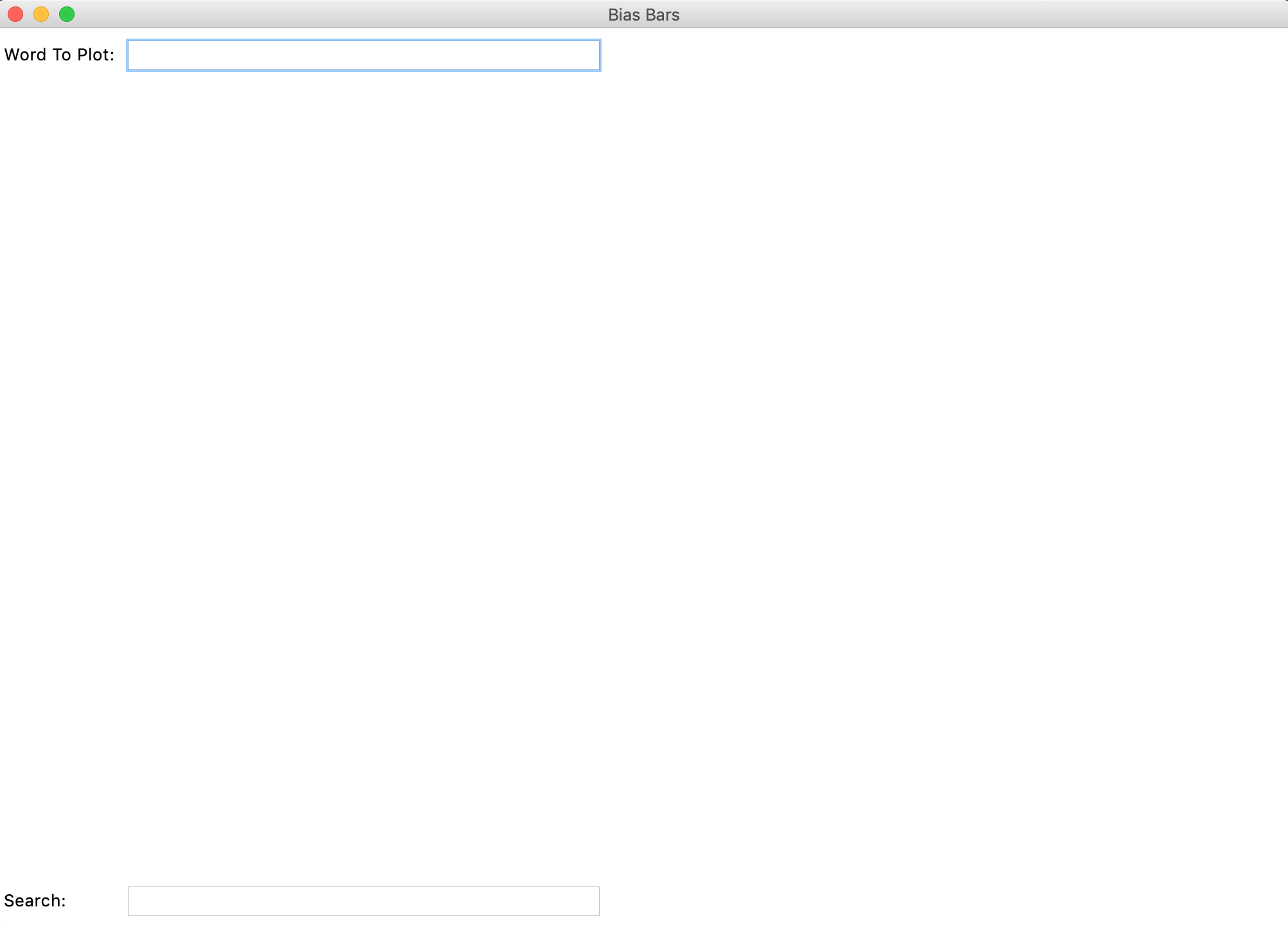 Figure 5. Blank Bias Bars Graphical Window
Although this program might appear boring, it has actually loaded all of the word count data information behind the scenes, and normalized the word counts into frequencies (that is, all the counts for women have been scaled by the total number of words in reviews about women, and same for all the counts of men). To test this (and to test out the search_words()) function you wrote in Milestone 4, try typing a search string into the text field at the bottom of the window and then hit <Enter> . You should see a text field pop up in the bottom of the screen showing all words in the data set that match the search string, as seen in Figure 6.
 Figure 6. Bottom portion of the Bias Bars window after entering the search string
 'awes'
Once you have tested that you can run the graphical window and search for words, you have completed Milestone 5.
Milestone 6: Drawing the fixed background content
In this milestone you are going to draw the rectangular plotting area and review quality labels on the provided canvas.You will be implementing the draw_fixed_content() function in biasbars.py
Here are the constants that you will use for Milestones 6 and 7:
VERTICAL_MARGIN = 30
LEFT_MARGIN = 60
RIGHT_MARGIN = 30
LABELS = ["Low Reviews", "Medium Reviews", "High Reviews"]
LABEL_OFFSET = 10
BAR_WIDTH = 75
LINE_WIDTH = 2
TEXT_DX = 2
NUM_VERTICAL_DIVISIONS = 7
TICK_WIDTH = 15
In this milestone, our goal is to draw the fixed rectangle defining the plot area and the three review quality labels along the x-axis of the plot. To do so, you will implement the draw_fixed_content() function. We have provided three lines of code in this function that clear the existing canvas and get the canvas width and height. Once this function is done, your graphical window should look like Figure 7 (minus the red highlighting and labeling).
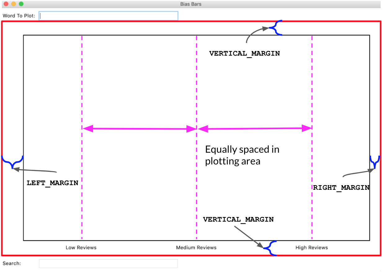 Figure 7. This is the Bias Bars window after
 draw_fixed_content() has been called, with the canvas area highlighted in red and relevant measurements annotated. Note: The vertical dashed lines and red border are shown for explanatory reasons and should not actually be drawn in the canvas!
Note: In the GUI (Graphical User Interface), the text field labeled "Word to plot:" takes up the top of the window, and the canvas is a big rectangle below it. The "Search:" text field is at the bottom of the window below the canvas. When we refer to the canvas, we are talking about the red highlighted area in Figure 7.
To complete this milestone, you should follow the following steps.
- Draw a rectangle on the canvas whose four corners define an area that is offset from the boundaries of the canvas by
VERTICAL_MARGINon the top and bottom,LEFT_MARGINon the left, andRIGHT_MARGINon the right. Moving forward, we will define the region delineated by this rectangle as the "plotting region". When drawing this rectangle, you want the lines to appear thicker than the default – to accomplish this, include the optionalwidth=LINE_WIDTHparameter in any calls tocreate_rectangle() - For every label in
LABELS, display that label in its appropriate position on the canvas. Here are the important things to keep in mind when plotting the labels:- Imagine splitting the "plotting region" into three evenly sized vertical regions. Each label is drawn in one of these regions and should be centered in its region. Another way of putting this is that the x coordinates of the labels should be evenly spaced in the plotting region, as shown in Figure 7.
- The trickiest math here is computing the x value for each label. For this reason, we ask you to decompose a short helper function called
get_centered_x_coordinate(), which takes in the width of the canvas and the index of the label you are drawing (where "Low" has index 0, "Medium" has index 1, and so on) and returns the appropriate x coordinate. You’ll need to account for the margins on the left and right when writing this function, as the x coordinates should be evenly spaced across the plotting region. Bothdraw_fixed_content()andplot_word()(written in Milestone 7) need to have the exact same x coordinate for the center of each region, which makes this a valuable function to decompose. We have provided several doctests for theget_centered_x_coordinate() function. - Each label should be drawn at a vertical offset of
LABEL_OFFSETpixels from the bottom line of the plotting region. - The tkinter
create_text()function takes in an optional anchor parameter that indicates which corner of the text should be placed at the specifiedx,ycoordinate. When calling thecreate_text()function for these labels, you should specifyanchor=tkinter.Nas the last parameter to indicate that thex,ypoint is at the top-center edge of the text.
By default, main() creates a window with a 1000 x 600 canvas in it. Try changing the constant values WINDOW_WIDTH and WINDOW_HEIGHT that are defined at the top of the program to change the size of the window and canvas that are drawn. Your line-drawing math should still look right for different width/height values. You should also be able to temporarily change the margins constant to different values, and your drawing should be able to use the new value. This shows the utility of defining constants— they allow you to define values that can be easily changed and all the lines that rely on this value remain consistent with one another.
Once your code can draw the fixed rectangle and labels, for various heights and widths, you can move on to the next milestone.
Milestone 7: Plotting the word frequency data
In this milestone you are going to plot the word frequency data and dynamic y-axis labels that help to interpret the data in word_data.You will be implementing the plot_word() function in biasbars.py
We have reached the final part of the assignment! Now it is time to plot the actual word frequency data that we have worked so hard to organize. To do so, you will fill in the plot_word() function. We have provided some lines of code for you already, which use your draw_fixed_content() function to draw the plotting region and bucket labels, fetch the width and height of the canvas, and then extract the frequency data for the provided word and calculate the maximum frequency across that data entry (we'll explain the importance of this shortly). The parameter word is a string representing the word whose frequency data you want to plot (already normalized to be all lowercase) and the parameter word_data contains the dictionary that you built up in Milestones 2-4. The plot_word() function is called every time that the user (you) enters a word into the top text entry field (labeled "Word to plot:") and hits <Enter> . If you enter a word that is not contained in word_data into the top text entry field, a message will display on the top right, and that word will not be passed along to the plot_word function.
When plotting the name data, you should consider the following tips (most of which are illustrated in Figure 8):
- There should be
NUM_VERTICAL_DIVISIONStick marks evenly spaced along the y-axis. Each tick mark should be represented by a line with lengthTICK_WIDTHand horizontally centered on the y-axis. When drawing line segments, you want them to appear to be the same thickness as the boundary line. To accomplish this, include the optionalwidth=LINE_WIDTHparameter in any calls tocreate_line() - For each tick mark on the y-axis, you should add a label representing frequency, which should be vertically centered on the corresponding tick mark. The label for the lowest tick mark should have value 0 and the label for the highest tick mark should have a value of
max_frequency(the maximu frequency across all genders and rating review buckets), which we have already calculated for you. The remaining labels should be evenly spaced between 0 and the value of the highest label. All labels should be evenly spaced along the y-axis of the plotting area and be offset byLABEL_OFFSETpixels to the left of the left edge of the plotting area along the x-axis. All labels should be represented as integer values. When calling thecreate_text()function for these labels, you should specifyanchor=tkinter.Eas the last parameter to indicate that thex,ypoint is at the right-center edge of the text. - For each comment source, the graph will have one bar to represent the frequency for women and one bar for men, side by side. The bars for women will be one color, and the bars for men will be another. You can choose any colors for your bars as long as the bar for women is on the left and the bar for men is on the right and the color is light enough that you can read the gender label (discussed below). The color of a rectangle can be specified with the optional
fill=colorparameter tocreate_rectangle(). List of recognized tkinter colors here. In our diagrams we used'dodgerblue'for the left bar and'orange'for the right bar. - The two bars for each label/bucket should be centered on the same x coordinate that the label is centered on (indicated with dashed lines in Figure 8). Hint: We encouraged you to decompose the
get_centered_x_coordinate()function for a reason! - The height of each bar should be calculated such that frequency 0 is at the bottom of the graph, the maximum frequency is near the top of the graph, and all other frequencies are evenly-spaced in between. The width of each bar is given by the
BAR_WIDTHparameter. When indexing into the gender_data dictionary you can make use of the two constants from the earlier part of the assignment by usingbiasbarsdata.KEY_WOMENandbiasbarsdata.KEY_MEN. - For each bar, also display a label at the top of the bar that shows
“W”if the bar represents frequency for women and“M”if for men. This gender label should have a buffer ofTEXT_DXhorizontally from the top-left corner of each bar – the y-coordinate should be the same as the y-coordinate of the top of the corresponding bar. You should not display this label if the frequency of that bar is 0. When calling thecreate_text()function for these labels, you should specifyanchor=tkinter.NWas the last parameter to indicate that thex,ypoint is at the top-left edge of the text.
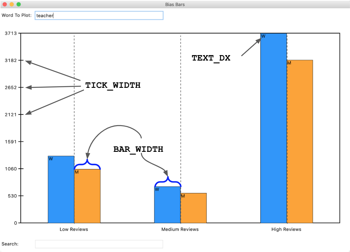 Figure 8. Example BiasBars plot with labeled constants in use for different components of plot
If you are having trouble getting the right coordinates for your lines or labels in your graph, try printing the x/y coordinates to check them. When writing programs involving graphics, you can still print to the Python console. This is a useful way to debug parts of your program, as you can just print out particular values and see if they match what you were expecting them to be.
Once you think you have your code working, you should test by entering some words (one at a time) in the top text entry bar of the Bias Bars window. We've provided some examples of sample output throughout this handout, so just make sure your visualization matches up with those examples!
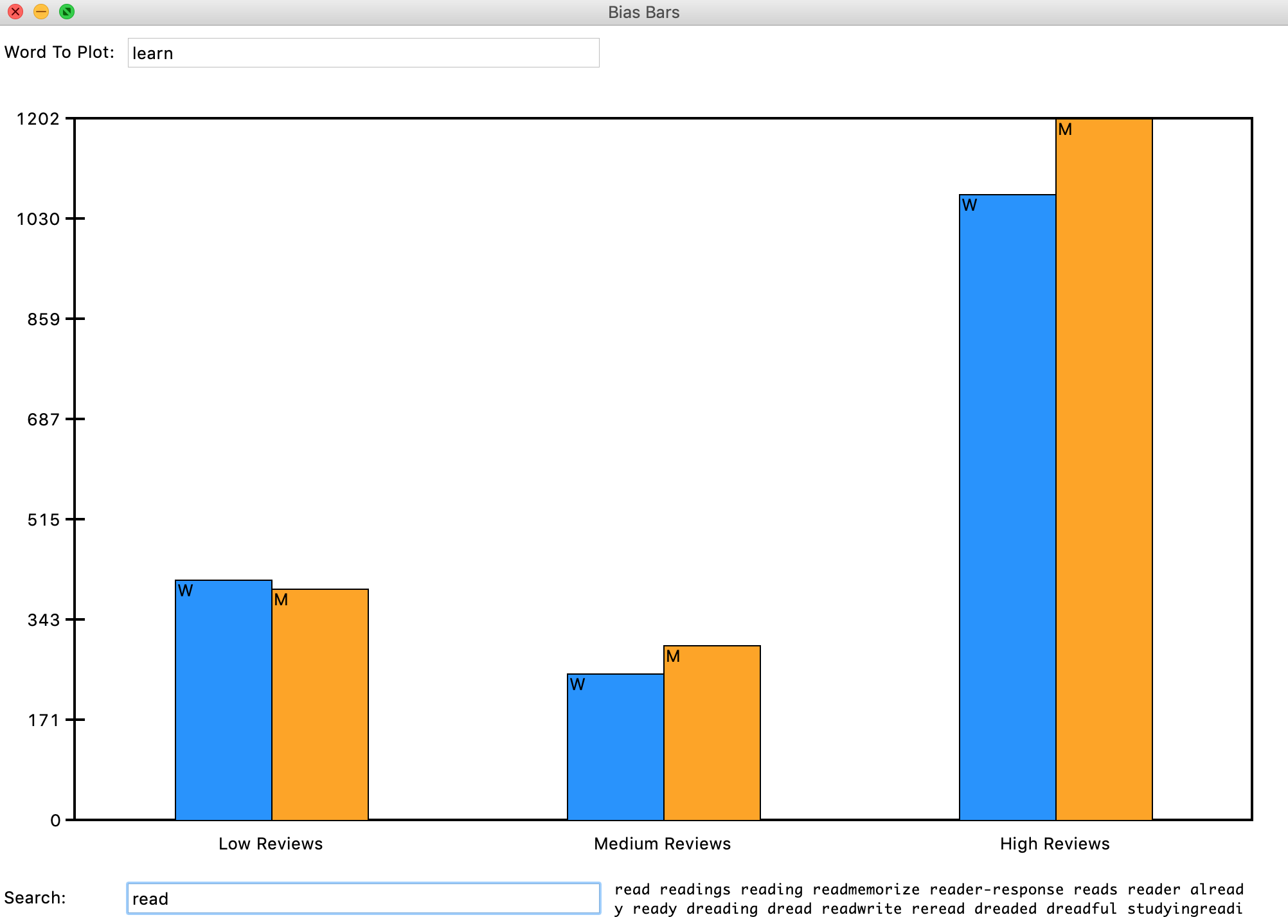 Figure 9. Final example run of the whole BiasBars program, with both plotting and search demonstrated.
Congratulations! You’ve wrangled a tough real-world dataset and built a cool visualization!
Milestone 8: Identifying bias in the dataset and other interesting data science ethics questions
In this milestone you are going to think critically about the RateMyProfessors.com dataset and reflect on the relevant ethical issues that computer scientists should consider when working on data science problems.You will be answering the following questions in ethics.txt.
Throughout the quarter, we've asked you to wrap-up your assignments by reflecting on relevant ethical issues related to the programs that you've implemented. Along the way we've covered topics of image manipulation and idealization, efficacy of simulation, and thoughts around the importance of representation. The ethics activity this week will be a culmination of all the critical thinking skills you've developed over the course of the last few assignments and will be more substantial than usual, given the many critical issues that can arise when working with datasets that have real data that is based on data describing real people. Remember our moral from the earlier tale of Microsoft's Chatbot or Google's Translation software? That is, computer scientists need to consider the social impacts of their work at the beginning of their design process. We hope that these questions will provide a foundation for you to think critically about the social impacts of your work as you continue on into the wonderful field of computer science! As usual, please take the time to seriously think about each of the questions presented below and answer each in at least 2-3 well thought-out sentences.
- Plot a few “neutral” words such as class, the, and teach. What do you see? Now plot a few more "loaded” words (thick normative terms) to investigate potential biases in the dataset. Possible examples: funny, rude, professor, teacher, mean, fair, unfair, genius, brilliant. What do you see? Include at least three “loaded” words and their corresponding frequencies for men and women for the high, medium, and low groups in your
ethics.txtfile. - Based on the definition of bias presented in class on Tuesday, July 27th:
- Do the summary statistics you produced in Milestone 1 (that is, percentage of reviews by gender that are high) suggest that high ratings are biased by gender or not?
- Which of the words you plotted in the first question of this milestone show a gendered bias?
- Based on the definitions of fairness presented in class, under what conditions (that could be observed from a dataset like this) would it be unfair for a university to use either the ratings or the prevalence of particular words (such as brilliant or genius) as a factor in decisions to hire, tenure, or fire professors? Assume the universities are using end-of-term student evaluations written by their own students, which might have different distributions.
- What kind of information do the subjects represented in a dataset (in this case, professors) deserve to know about the trends in the data? How could you as the programmer provide this information?
- In class, we discussed problems of underrepresentation and “long tails” in data science. Although the data we gave you has not been edited other than to remove punctuation, our visualization focuses on average scores and commonly used words. What kinds of interactions between students and teachers, both positive and negative, might be uncommon or not well represented by this dataset but important? For example, how might underrepresented students’ positive experiences of underrepresented teachers appear or not appear in this dataset?
- In this assignment, we asked you, “does a professor's gender influence the language people use to describe them?” That is an important question, and we haven’t given you the right kind of data to fully answer it: the dataset presents a binary classification of gender based on students’ beliefs as to the gender of the professor. There are some people in the dataset whose gender is misdescribed, and others, such as non-binary people, who do not have a category that fits them at all. If you could design the ratings website, how might you change or remove categories to address this problem?
- In 106A, we create clearly-defined assignments for you to work on. We tell you what to do at each step and what counts as success at the end. In other words, we are formulating problems for you to solve. As we discussed in class, however, problem formulation is one of the ways in which your choices as a computer scientist embed values. Formulate a different problem related to the topics of professor evaluation or visualization of gendered patterns in language use, ideally one you could solve with your current skills. Explain why and for whom it would be good to solve that problem.
Once you've finished through thinking through and answering all these questions, make sure to stop and really admire the magnitude of what you've accomplished! You've wrangled a complex real-world dataset and used it to flex your ethical and critical thinking skills. Congrats on making it to the end!
Optional Extra/Extension Features
There are many possibilities for optional extra features that you can add if you like, potentially for extra credit. If you are going to do this, please submit two versions of your program: one that meets all the assignment requirements, and a second extended version. In the Assignment 6 project folder, you can create a file called extension.py that you can use if you want to write any extensions based on this assignment. You can potentially have more than one extension file if you are, say, extending both the data processing portion and the graphics portion of the assignment. At the top of the files for an extended version (if you submit one), in your comment header, you should comment what extra features you completed.
Here are a few extension ideas:
- Plot data for more than one word at once. Right now, our program is limited to plot word frequency data for only one word at a time. See if you can extend that functionality by plotting multiple bars on the graph, either horizontally or vertically. When you enter content in the top text field, your
plot_wordfunction gets back the whole string inputted there, so you can enter multiple words separated by spaces and handle that sort of input in theplot_wordfunction. - Visualize another dataset. Can you use your program to visualize a dataset from a different data source? What other data sets are you able to plot? The world is your oyster! We’ve posted a separate Guided Extension handout on the assignment page with suggestions for a few datasets for you to use.
Submitting your work
Once you've gotten all the parts of this assignment working, you're ready to submit!
Make sure to submit only the python files you modified for this assignment on Paperless. You should make sure to submit the files:
- rating_stats.py
- biasbarsdata.py
- biasbars.py
- ethics.txt