Design Process
Week 6 Wizard of Oz Testing
First Round of Wizard of Oz Tests
Design prototype of shortlisted ideas
Among the 4 ideas we had in week 5, we conslidated and selected 2 ptototypes we want to test. These are:
- News Feed Browsing
- Space Exploration
We would like to observe if the users can explore the functionalities naturally, these include the main function we want to provide (reading news or exploring the space) on the main screen, as well as the volume control function. Overall, we also want to know if the users feel relaxed when they are using the application. We also include additional UI designs for the 'News Feed Browsing' prototype to find out the most natural and intuitive layout for users to browse through the categories of the news feed.
-
Rotating wheel display - User waves the hand to rotate the wheel until the desired category stops at the "select box" 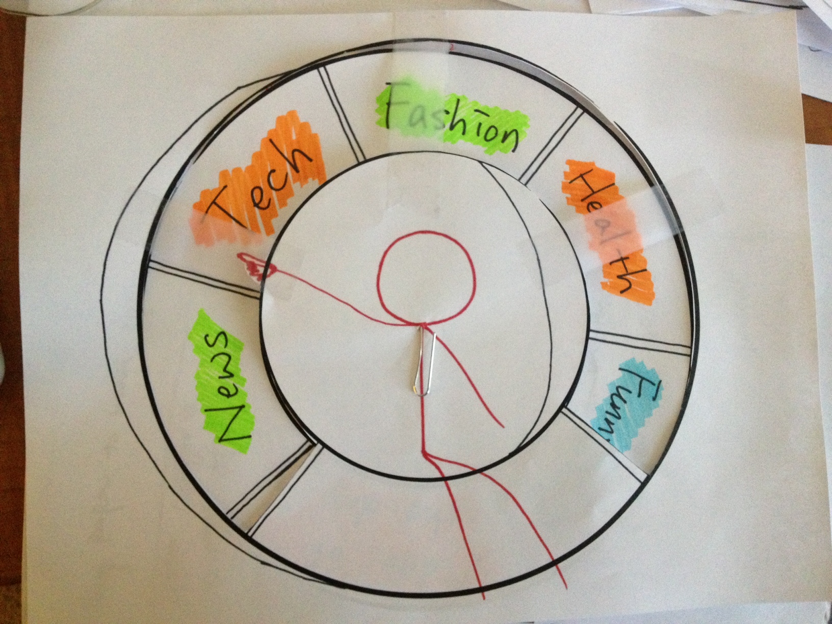
-
Magazine cover display - User waves the had to browse the cover of magazines 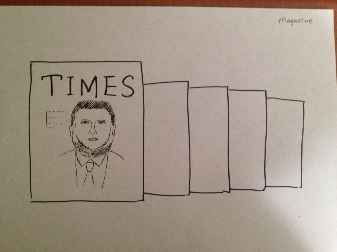
-
Arch display - User moves the arm upward at different angles to choose the category 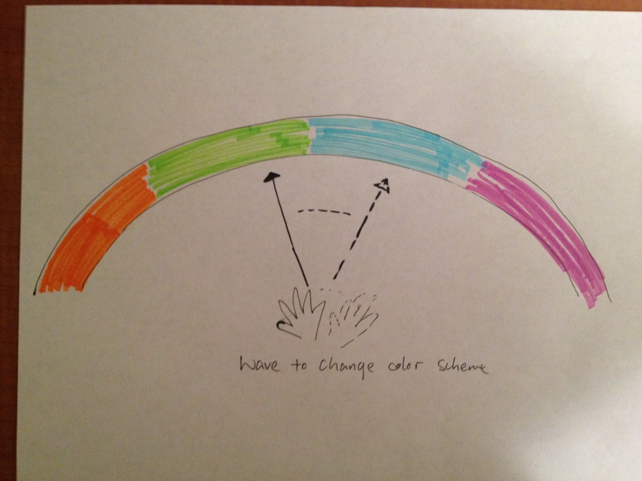
-
Book shelf - User hovers over the object to select 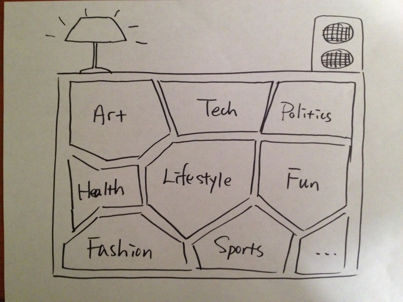
1. News Feed Browsing - Tile Display
In this Wizard-of-Oz user test, we want to place our focus on the actual gesture interaction part, therefore, we cut the part which allows users to customize the environment according to their mood because we thought that the customization part is of lower priority comparing to the gesture interaction part that follows.
Description of the prototype
As a quick recap of the flow of the news feed reading prototype, the user enter the interactive space, which shows an array of news feed content. We would like to display the news in a simple, easy-to-read manner such that the user need minimal mental power to digest and read the content. In this design, we would like to provide a simple and efficient interface to the user such that she can keep herself updated with the happenings aorund the world in a relaxing environemnt.
-
1 You can choose news feed from different categories 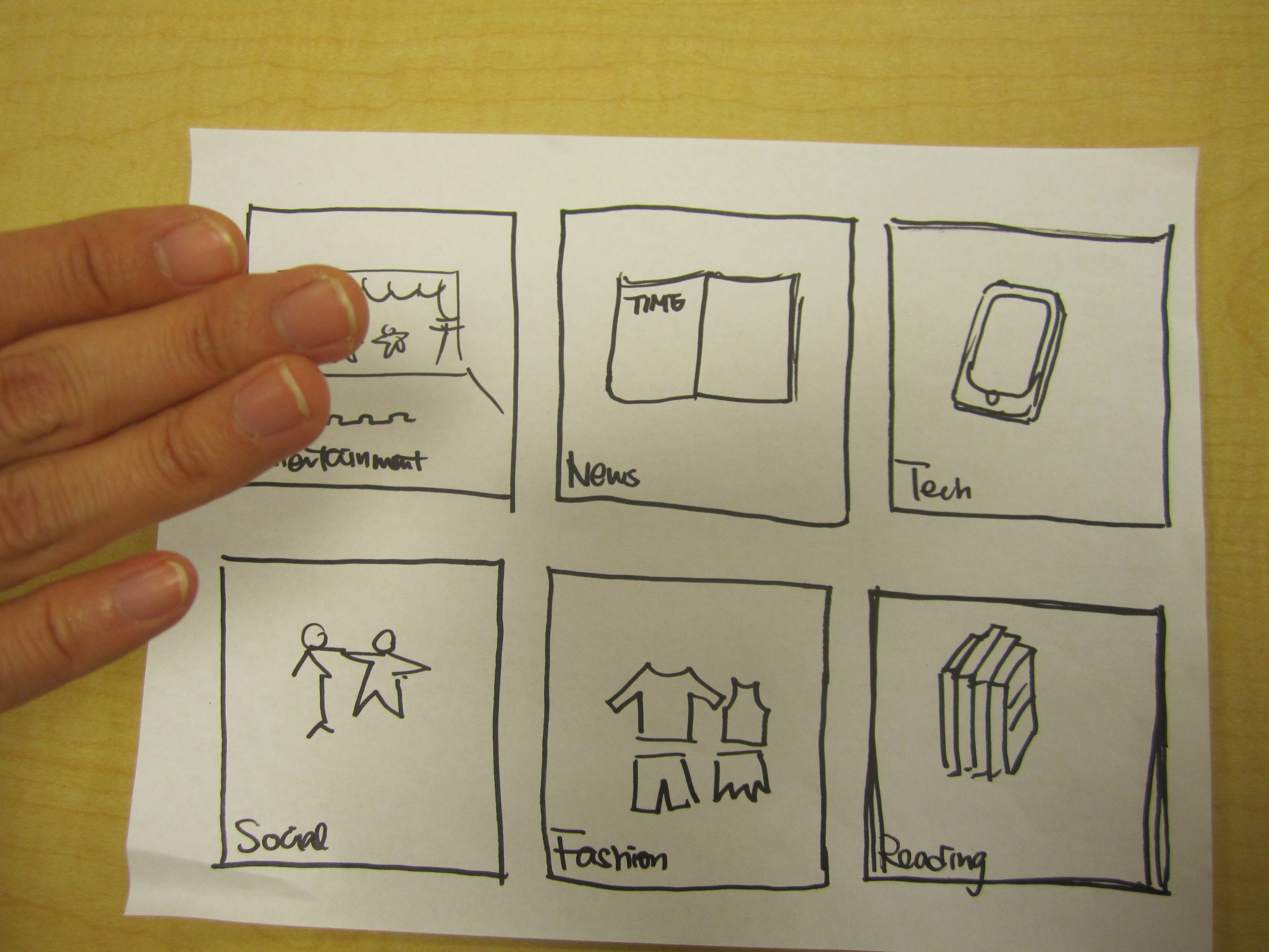
-
2 You can then browse the selected news within the category by tapping on the tile 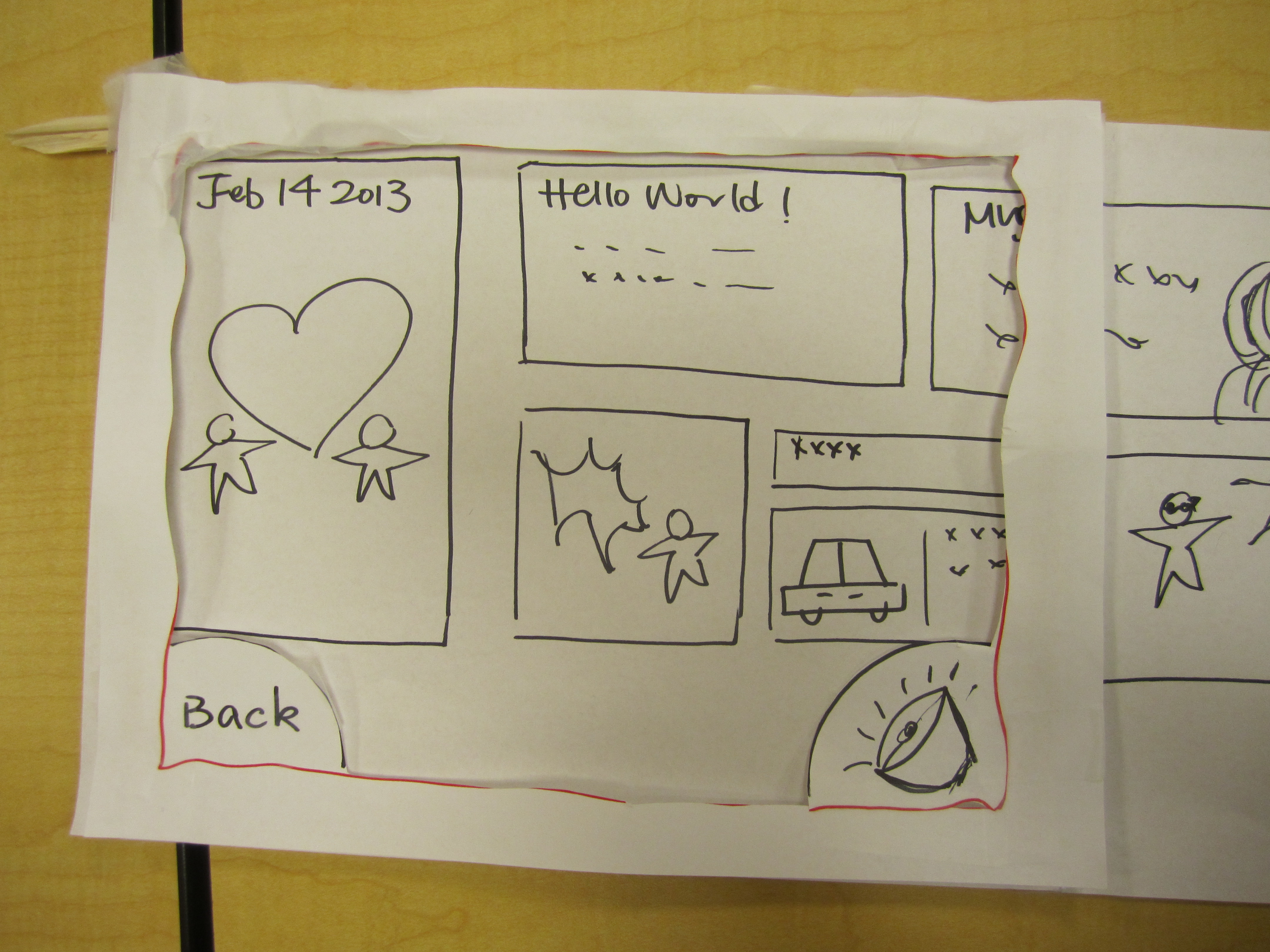
-
3 Tab to read the content 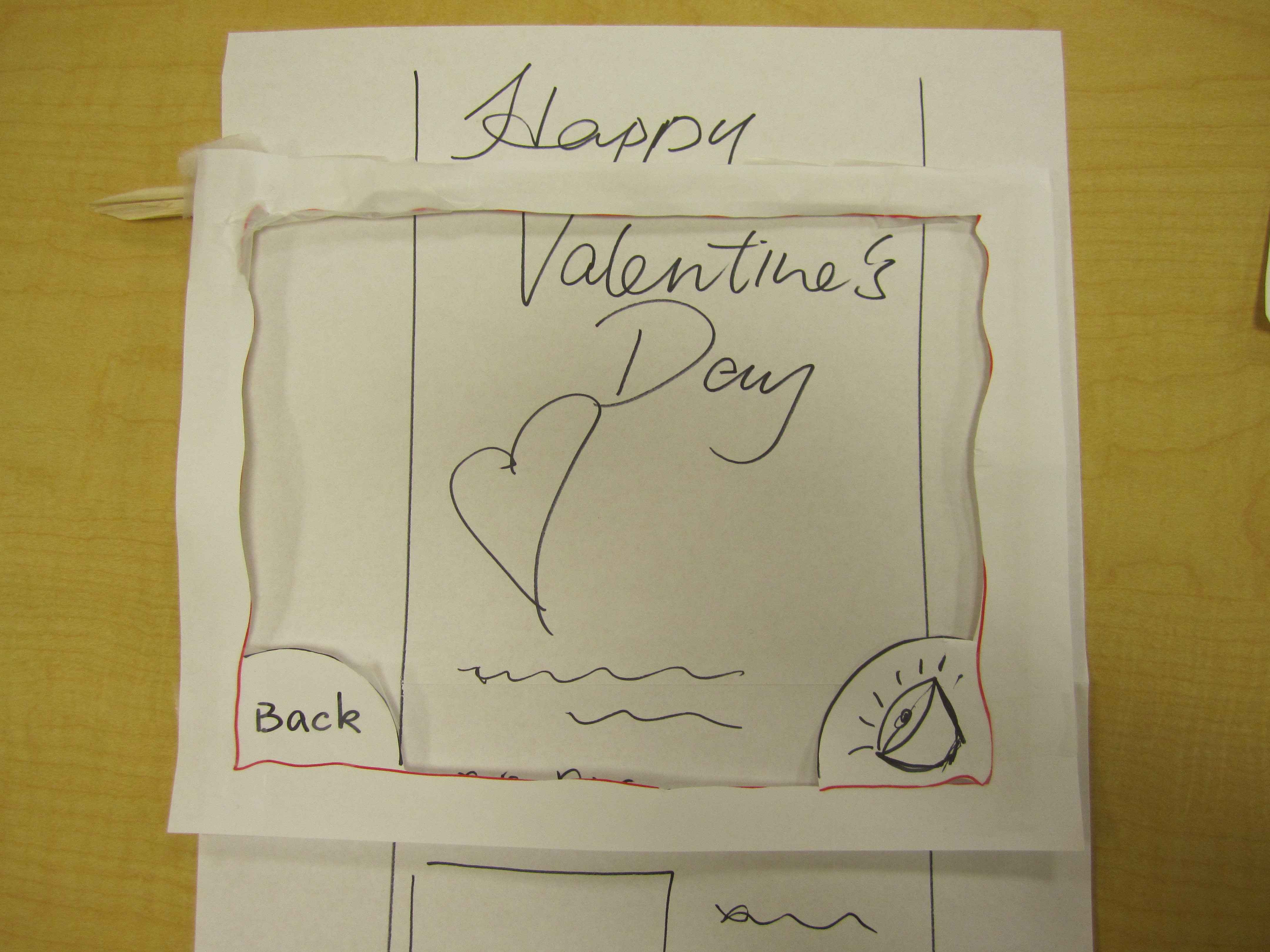
-
4 Tab the specker icon to control volume by raising or lowering your hand 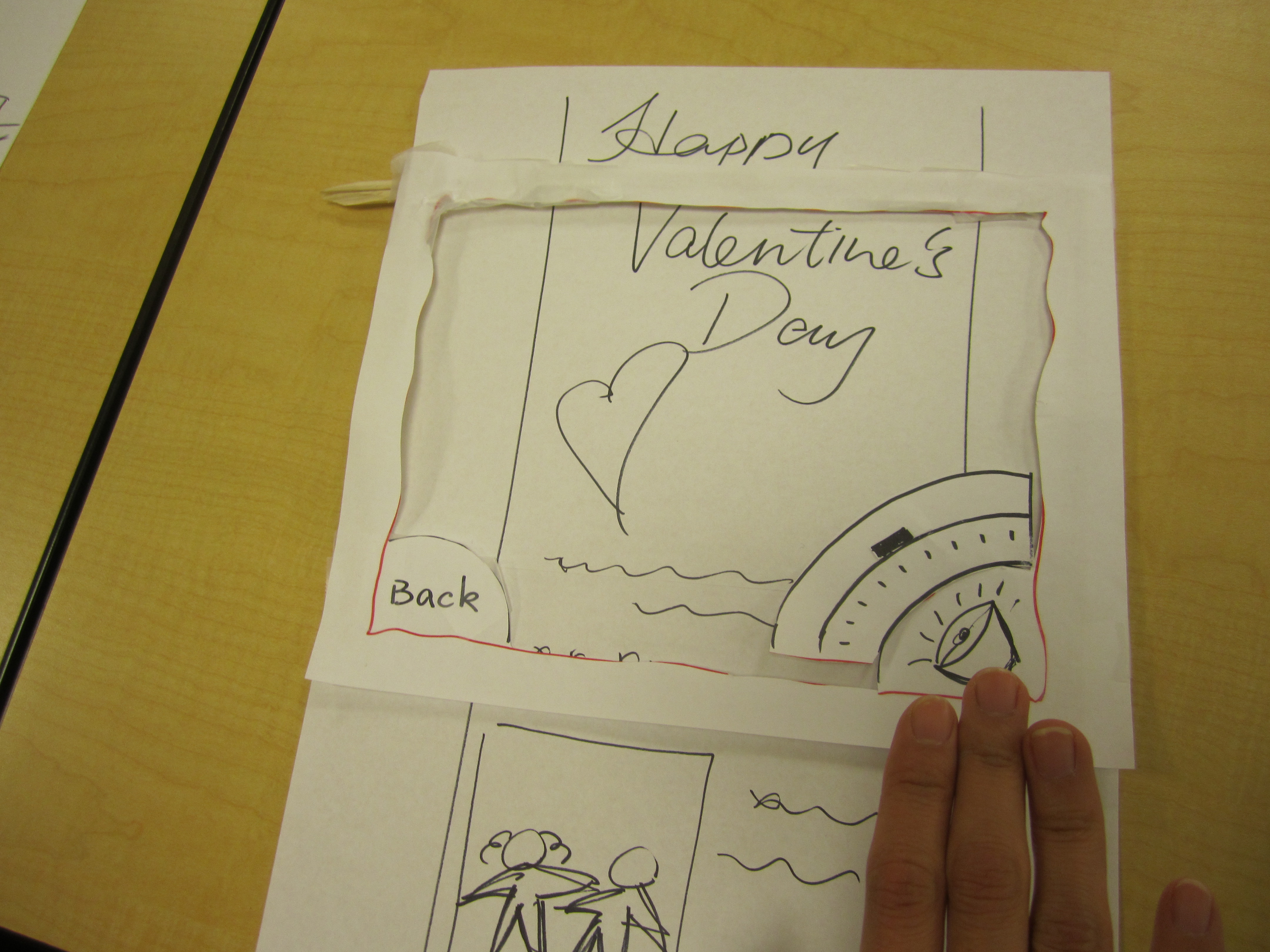
Video of Wizard-of-Oz testing of News Feed Reading - Tile Display
Key Insights
Usability:
- The drawing of volume button seemed to be confusing. The user thought that it looked more like a bell and did not know that the pop up is used to control the volume of the music.
- User seemed to point at his selections rather than hover over it.
- The user suggested that the size of the texts was small.
- The user tried out gestures that related to zooming in and out, but there were not supported.
- When the user waved his hand horizontally, the wizard did not know which direction he wanted to navigate. There was confusion on the direction of scrolling.
- The user looked confused when he selected back button and the previous page poped up.
- The "holding 3 seconds to select" function was not clear and the user could not follow.
- The exit from the volume setting needed to be more clear. The user had to hover on the volume button to exit which was not intuitive.
Usefulness in creating a relaxing space:
- The user felt that the app was not relaxing as sometimes he needed to concentrate on how to select and what coming next after selection.
- The user was not sure of what the goal of the app was.
- The user suggested allowing users to customize the news feed.
2. News Feed Browsing - Cover Flow
From our first wizard-of-oz testing of the news feed reading prototype, we found out that skipping the mood customization part did not provide the user a smooth flow to dive into the interaction and start relaxing by reading. In the cover flow display version of this reading prototype, we included the mood customization part to observe the difference between these tests (with and without the mood customization).
Description of the prototype
- First, the user customizes the environment with her mood of the day with one song that best represents the mood
-
1.1 Customizing the space with a song that represents your mood 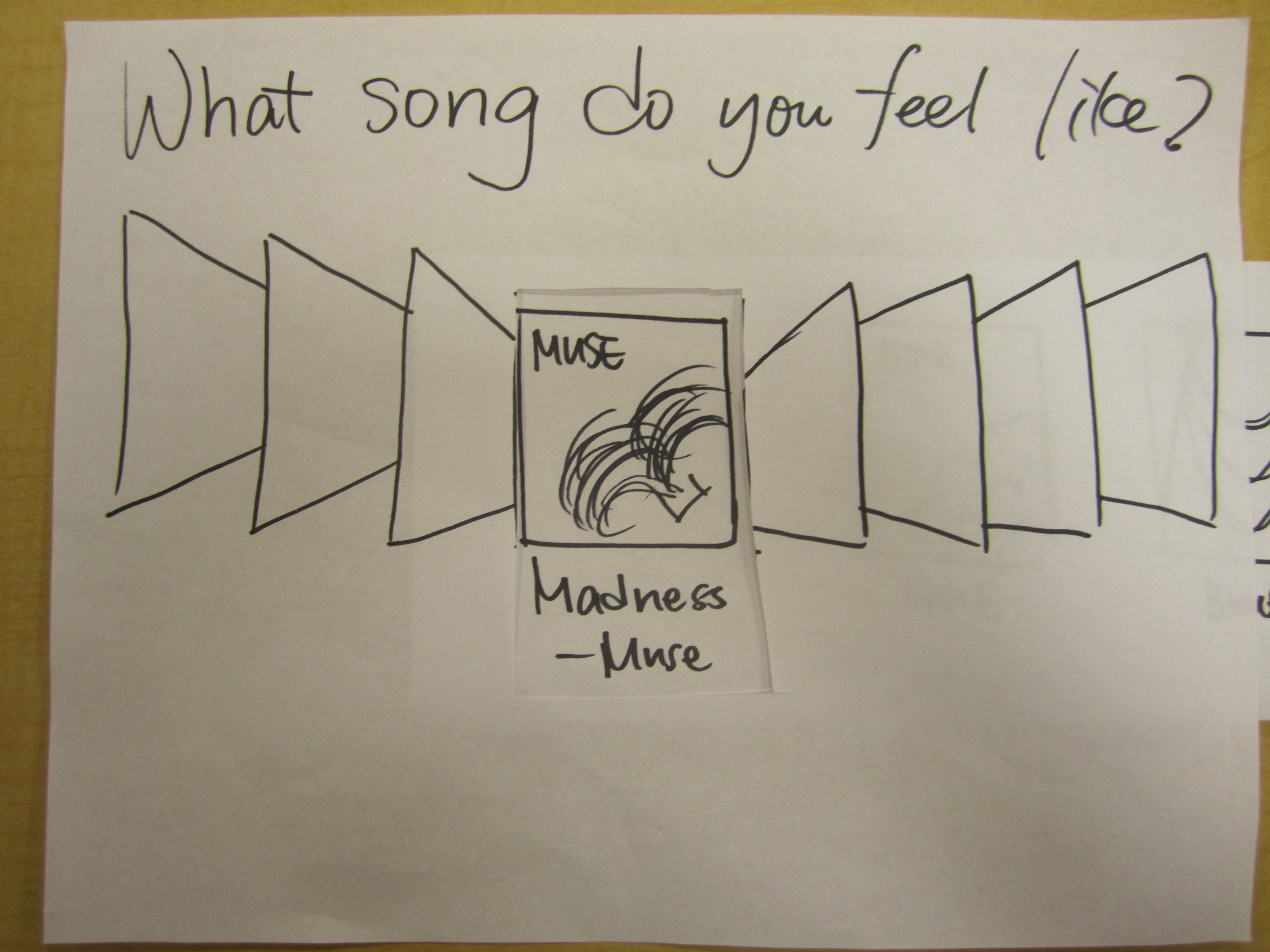
-
1.2 Based on your song, Spaatify adjusts lighting and music to reflect your mood 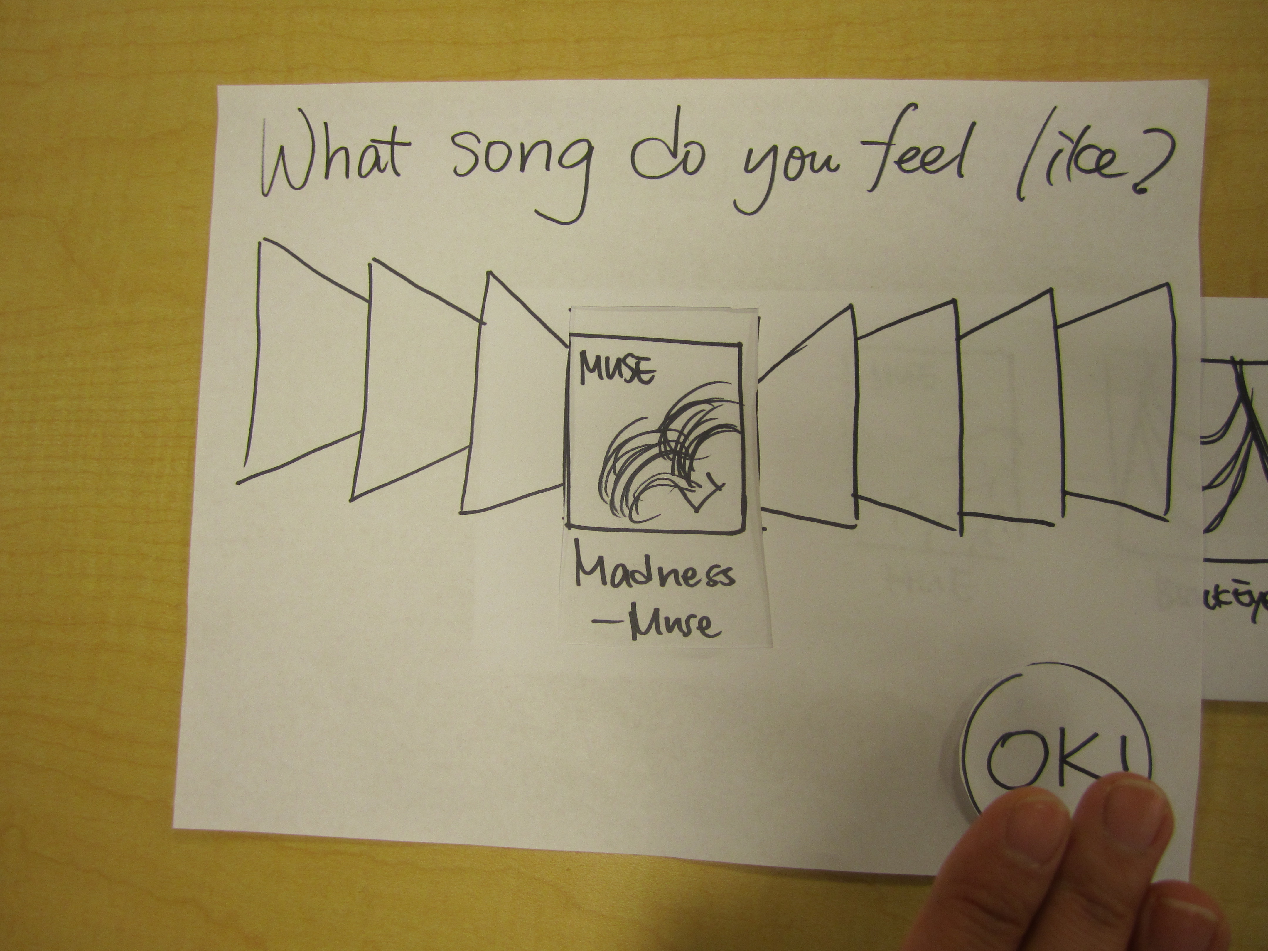
Then, after customizing the environment (music and lighting), the user see the categories of news feed in a cover flow layout
-
2. You can choose news feed from different categories by waving your hand to flip the covers 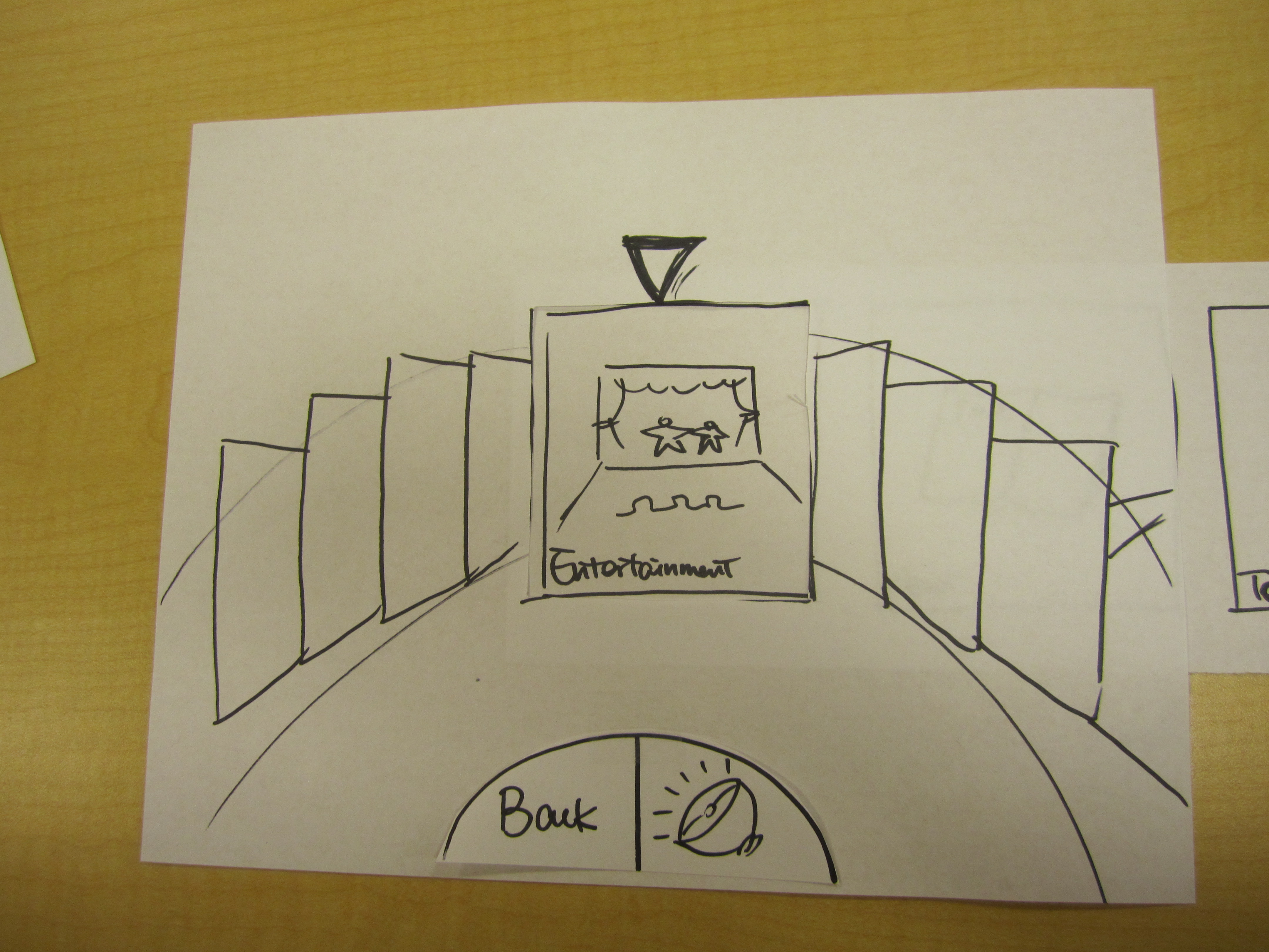
Video of Wizard-of-Oz testing of News Feed Reading - Coverflow Display
Key Insights
Usability:
- By choosing a song at the customization step, the user thought that she would be watching a video and did not know that the song was mapped to lighting and music.
- She didn’t realize that she was looking a news feed once she got on the “flipboard” page.
- The gestures to control the direction of scrolling was unclear.
- The user treated it as a touch interface at some point, rather than using hand to hover.
- The user was confused about the volume button.
- The user showed confusion as she couldn’t figure out how to exit.
Usefulness in creating a relaxing environment:
- The user liked the addition of music to the environment.
- The user didn’t understand the purpose of the app.
3. Space Exploration
Description of the prototype
The user enter the interactive space, which shows the view of the universe. In this design, we would like to create a serene and simple environement for the user while the user is enjoying the bathtub and navigating the universe with the hand and arm gestures.
-
1 You will then see a large screen showing the universe 
-
2 Move your hand to zoom in and rotate 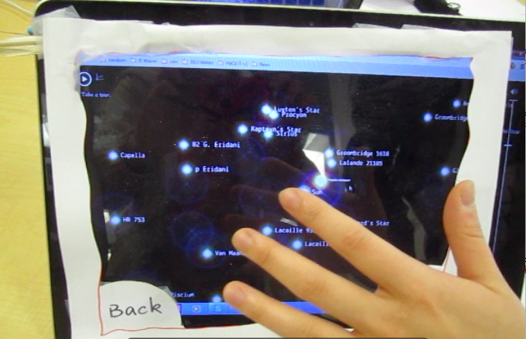
-
3 Zoom-in view of the universe 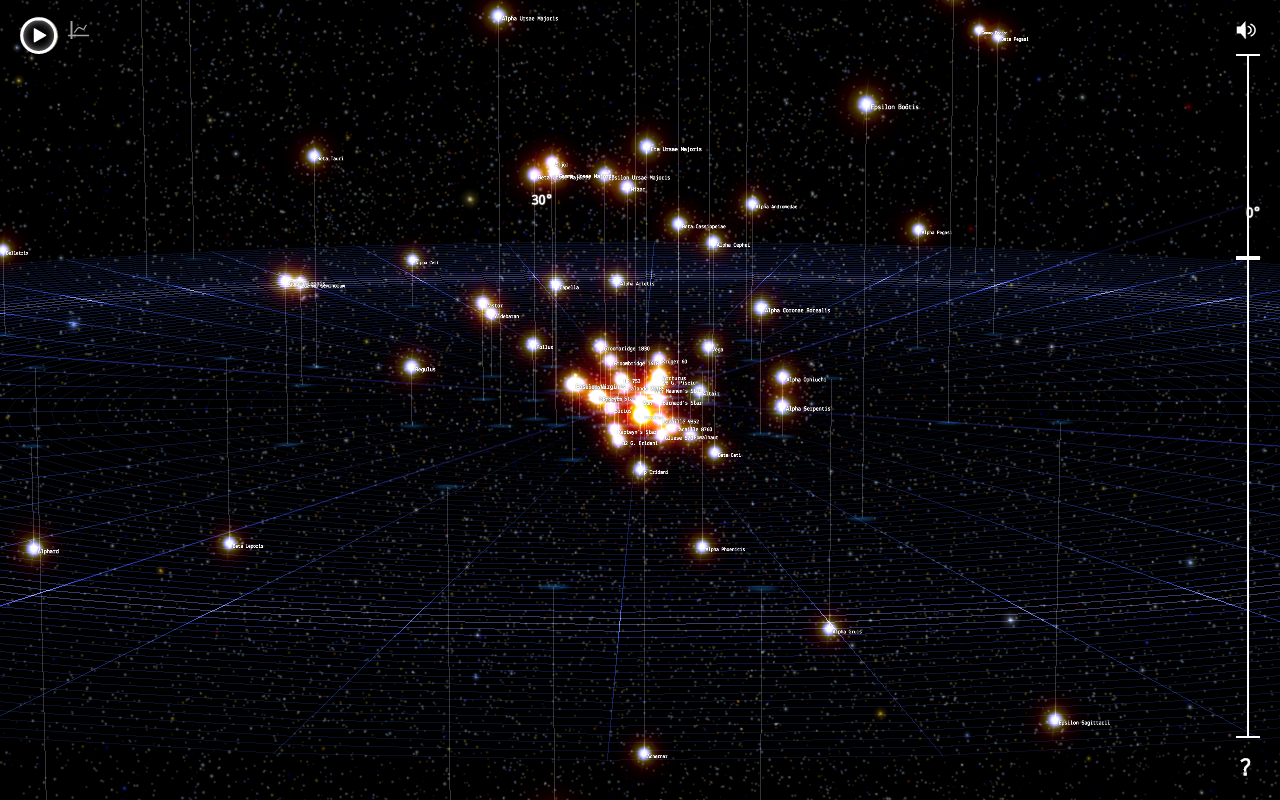
-
4 Tab on object to view infomration 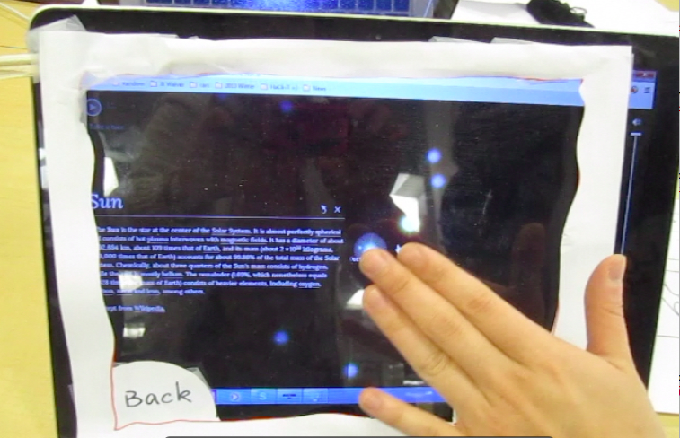
Video of Wizard-of-Oz Space Exploration
Key Insights
Usability
- The user used a finger instead of the hand to navigate for majority of the testing.
- The user leaned forward and backward for zooming, instead of using two hands.
- The arrows which hinted the use of two hands to zoom were misleading - user thought that they meant left and right rather than the zooming in and out
- The user was unsure about how to exit from the screen.
- The user did not know volume button was to control volume.
Usefulness in creating a relaxing environment
- The user found that the most of the gestures were intuitive.
- The user felt like that there was a bit too much movement in the bathtub so it wasn’t very relaxing.
- The user suggested the idea of a “tour of the universe” instead of active navigation.
- The user was not clear about the goal and structure of the app
- The user suggested that the exploration needed to be more engaging, for example, adding in label and relative position of the user in the space to give him a sign of status.
Lessons Learned from the First 3 Wizard-of-Oz Tests
After the three in-class tests we synthesized the following main points:
- Our goal and functionality was not clear from the UI design
- the users did not know what to expect with the app, and what the tasks were
- a lot of attention was focused on the content of news, which seemed to be the important factor that determined whether the users can feel more relaxed after reading.
- The flow of the tests was not very smooth and there was lagging when the wizard observed the gesture and made changes to the prototype at the same time.
- We need to test the prototype on our target audience or at least provide the bathtub setting to mimic the atmossphere
- most students don’t even have a bathtub or not using a bathtub daily
- 2 out of the 3 users let us know that they don’t like taking baths and they wouldn’t necessarily read while bathing either
- We need to do more of the initial research about what reading makes people feel relax
- The initial mood customization had to be re-deisgned because it is an important step to personalize and prepare the user to get ready to the relaxing the environment the app would provide.
- A better set-up (a spacious and quiet environemnt) and smoother flow of the test are needed.
Second Round of Wizard-of-Oz
Why bother to have second round?
Based on the feedback from our first prototype, we realized that despite the usability issues, it is hard to tell the more important feedback - how does user feel without the environment set. And due to the low fidelity of hand drawing, users also got distracted by trying to recognize what was the content on the screen. Therefore, we decided to do a slightly higher fidelity prototype using digital mock-up (since eventually our system is likely to be projected onto a wall, so hopefully this prototype would give us more realistic feedback).
Description of the new reading prototype
In this prototype, we made a couple of major changes based on our previous feedback:
- Instead of using “Mood”, which can be quite hard to tell(say, it’s hard for a user to get in the bathtub and choose “I’m sad right now, and expecting music for sad people?”), we let user to pick different “Theme”, such as beach, picnic, forest and galaxy. After user picks a theme, the background image, music and lighting will be adjusted according to that theme throughout the rest of the experience unless they’re changed by user.
- Restructured the content we want to present: previously we displayed news feed categories such as entertainment, tech, etc. However from the testing, our users suggested they would be more relaxing reading something less lengthy(like comics) or watch videos. So we reorganized the categories to see which ones caught more interest from the users.
- The realistic feeling improves quite much - now we can actually simulate the mouse as controlled by the user’s “hand”, go to the corresponding theme as they picked, and display the “real” content for them. The purpose for all of this is to create the real scene as much as possible and see whether user can feel the relaxing environment.
-
Video of Wizard-of-Oz Demo of reading prototype -
Video of Wizard-of-Oz Demo of space exploration prototype
1. Reading Prototype 2
Video of Wizard-of-Oz
Key Insights
Usability
- The user seemed to need more information about navigation in the beginning
- The user was entertained by the videos and music
- The user wasn't aware of the fact that you need to hold for 3 seconds to select
Usefulness in creating a relaxing environment
- The user found that the gestures were understable but not intuitive.
- The user suggested using folders like in the window for Mac HD for the newsfeed.
- The user suggested using circular motions instead of up and down fo the newsfeed so that it is separate gestures.
2. Reading Prototype 2
Video of Wizard-of-Oz
Key Insights
Usability
- The user seemed confused about the gestures but the wizard did a good job of just letting the user explore
- When the user was presented with the circular UI he assumed that you would have to turn the wheel
- The user wasn't sure about the gesture to scroll up or down
- The user suggested an alternative to waving back (left to right instead of right to left)
Usefulness in creating a relaxing environment
- The user asked about having more instruction for acceptable gestures beyond the first screen
- The user expressed concern about turning the wheel and having to reset his hands while turning.
- The user asked about sharing posts with friends or saving articles for later
- The user wanted a Pandora-like station in the setting. He perferred a shuffle of songs so that it's less interactive.
- The user suggested that the gesture should be more engaging
3. Reading Prototype 2
Video of Wizard-of-Oz
Key Insights
Usability
- The user switched hands more often when navigating through the universe
- The user easily figured out the gesture for zooming in and out
Usefulness in creating a relaxing environment
- The user seemed to be a bit more engaged and expressed his content
- The user felt that because there was more content it was more engaging
4. Full mock up of wizard of oz testing in design school with design coach, Doug
-
Video of Wizard-of-Oz test with coach - reading -
Video of Wizard-of-Oz test with coach - space exploration
Key Insights
Usability
- At some point during the session the user was tired so he switched hands
- The user voiced his selection for most of the session
- The user was entertained by the videos
- The user was famailiar with kinect gestures so there was no issue in figuring out the mapping of the gestures
- The user enjoyed the addition of music when choosing a
- To zoom out the user was just using one hand (downwards motion)
Usefulness in creating a relaxing environment
- The user asked about changing the volume of the music
- The user felt that the app was well executed
- The user wanted to be able to control lighting throught out the session
- The user wanted to be able to start and stop the videos being played
- While exploring the galaxy, the user wanted to change the music
- The user suggested the use of color to control the environment
5. Full mock up of wizard of oz testing in design school with Doug's friend
-
Video of Wizard-of-Oz test at d.school - reading -
Video of Wizard-of-Oz test at d.school - space exploration
Key Insights
Usability
- The pointer always appeared on the upper left so th euser's gestures always had a starting point
- The user had some trouble figuring out how to interact with the app
- The user was no sure about how to go back
- The user had a hard time figuring out how to select an object
Usefulness in creating a relaxing environment
- The user suggested having more instructions for the app
- The user was not pleased by the music so he suggested having a way to chaned it
- The user was very interested but wondered if the he'll be engaged at a later time since this would a home-installed device
Lessons Learned from the Second Round of Wizard-of-Oz Tests
After the second round of tests we synthesized the following main points which are useful for us to consolidate our design and move on to functional prototype:
- Having control of the environment is very important
- Changing the theme, lighting, and volume should be a global control. Meaning there should be a way for the user to change these variables on any given page
- Having controls on the screen and make space for larger modules
- User customization can be tricky when the user doesn't know what they want
- We talked about having the machine learn the user's mood rather than having them choose their mood
- The circular module is very intuitive
- When users were presented with the variation for the news feed it was clear that you had to turn the wheel in order to select
- We decided that the reading prototype would be the one to prioritize. The galaxy prototype would narrow our audience because it has a very specific theme and it would be hard to change it. The reading prototype is more commercial so we would be able to reach a broader range of audience.