 |
 |
Modeling Genetics Screens by Retroviral cDNA Transfer: Example Screen #1
This page demonstrates a genetic screen in which a near ideal phenotypic selection occurs.
-
The graph and explanations are excerpted from a down-loadable demonstration Microsoft Excel 5.0 file written by GPN for modeling genetic screens.
-
The equations in the Excel file are relatively primitive, do not take into account statistical representations of population dynamics, and are meant as a first time trial to help you think more intuitively about genetic complementation cloning by retroviral gene transfer.
-
Yes, there are more complicated versions of the file that one could write, and you are welcome to modify the equations in the spreadsheet after download.
-
If you have any interesting additions, please let me know and I will put them up on the site here and credit your brilliance.
-
For details on the use of these files please see the Excel File on download and documentation contained therein.
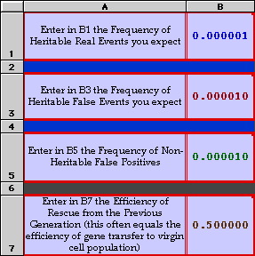
In this example the real event sought is set at 1 per million;
The heritable background is set at 1 x 10E-5;
The sporadic background is set at 1 x 10E-5 as well.
The efficiency of the rescue is set to 50%.
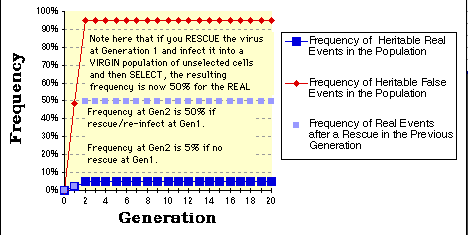
As expected, within two selection/generations you have selected for a population that still reflects the ratio of real to false events, but in which the real event is now nearly 5% of the total population and worth attempting to clone directly.
Note that if you rescue the insert and re-infect that you will get nearly 50% of the population (light blue squares) positive at the second round of selection.
-
The graph as presented here is relatively primitive. For example, the "rescue" graph (light blue squares) only considers the events from the previous generation and are therefore not connected by any line.
-
The graphs also assume that the rescue frequency is the same as the initial infection frequency upon transfer of the library to the cells at Gen_0.
-
The other major assumption in these graphs and equations is that only a single virus occupies each cell. More complicated equations requiring Poisson distributions can be applied if you want to rewrite the spreadsheet.
The numbers in the chart below (D20 through I20) are used to generate the graph above. There is usually no need to change either the numbers within the chart directly or to change the equations for each cell position. The numbers are derived originally from what you type in positions B1, B3, B5, and B7.

Related links:
Home Page |
Interests | Members
|
MTA Forms | Plasmid
Maps | Retroviral Systems
| Genetic Screens | Library
Systems | Protocols
| Tutorials |
Publications | Contact
| Virus Chat