Table Spreadsheet
< CS101
Spreadsheets and "Paradigm"
- Spreadsheets are a fantastic invention for applied math
- Everyone should be able to make a basic spreadsheet
- "paradigm" .. fancy word, but it applies here
- Paradigm 1 - encode math as formulas:
payment = balance * (1+interest);
- Paradigm 2
spreadsheet paradigm is row/column grid
encode math spatially in rows and columns
We are visual creatures - why this works so easily?
- History: Visicalc (1979), then Lotus, then Excel
- NPR Planet Money Spreadsheet Podcast
- Spreadsheets launched the "personal computer" revolution
Spreadsheet software - many options: Google docs has a free spreadsheet in the browser, and now Microsoft has a free browser one too with skydive (yay competition!). There's also the free open source Libre Office application. And the famous Microsoft Excel spreadsheet products which work great and are kind of expensive. Any of these will work for all our examples and homeworks.
Aside: How to Invent The Future
- Who Makes Great Software?
- The creators of the spreadsheet knew finance math and paper spreadsheet practices
- They also knew computers
- Lesson: knowing the problem domain may be the key to creating great software
-Know what problem to solve
-Know how users look at the problem
-Know the user's priorities
-as opposed to CS experts coming into a domain they don't know
- e.g. Perhaps a working biologist will think up the next great biology program, not a CS person dabbling in biology
- Hidden agenda: everyone should know a little CS
Monster Example
Monster example spreadsheet in google docs. Below we'll use this as a running first example. (consider: control-click .. open in new tab)
To edit above (or any of our spreadsheets): either (a) In google docs: File > Make Copy to edit. or (b) File > Download As > .xlsx file, and then edit using any program.
For references here is the monster spreadsheet in completed form
1. Spreadsheet Cells and Naming
- A spreadsheet is a rectangle of individual cells
- Each cell can contain number, date, text, .. whatever
- Addressing: columns are named: A, B, C, D, ...
- Addressing: rows are numbered: 1, 2, 3, 4, 5, ...
- So one cell can be identified like: B3, C12, A1, ..
Experiment: click on a cell, note its "address" B1 or whatever, type in a word or number
2. Columns of Numbers
- Very common to have a few columns of numbers
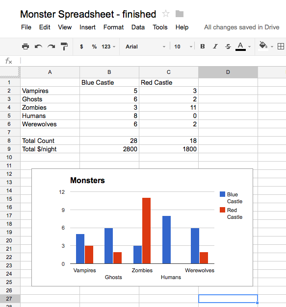
- e.g. the Red Castle and Blue Castle numbers here
- These are just raw numbers without computation
3. Add Computation: sum()
- Compute the total number of monsters in the blue castle
- Click on the B8 cell, a couple rows below the last blue castle number
- Good practice: leave a blank row between the raw numbers and your computed cell
- Type in the following "formula" (with the equal sign): =sum(B1:B6)
- The equal sign = at the start means this cell is computed from other cells
- The sum() adds up all the numbers in a range of cells
- The b1:b6 means the whole vertical group of cells from B1 down through B6 (lowercase or uppercase work the same e.g. b1 or B1 )
- Type in "Total Count" in the cell to the left (A8) to serve as a label
- Famous Reinhart/Rogoff bug - wrong cell range in formula
-Spreadsheet error made "austerity" look like a better strategy than it is
-Admirable of them to share their data with "reproduce" scientists
-Science is based on published methods and reproduction of results
Spreadsheet Editing Tricks
- When you change a number up above, the sum is automatically updated
- Once you type in the =sum(...) in the cell, it displays as the computed sum number (28 in this case)
- Single-click - edit up above
- Double-click - edit in the cell
- Esc key to cancel out of editing - a life saver
-somehow I always find myself editing a cell I did not want to edit
- Color shows cell-dependency (vs. wrong-cells bug)
- Click-drag alternative to typing "b1:b6"
- Using =sum() to add up a bunch of numbers is super common
From the headlines: Reinhart and Rogoff had a popular economics paper supporting austerity, but it had a significant spreadsheet bug. Essentially they wrote something like sum(a1:a8) when they intended (a1:a11), so they left out some numbers. This bug was significant in the paper's results. The subsequent history of the great recession has shown austerity to be a bad idea. Note when you double-click a cell, it shows you what it depends on to help avoid this sort of bug. It's amusing that such high level research can have ordinary bugs just like the rest of us, although of course this should be no surprise. Bugs are a common part of software.
4. Add Computation: + - * /
- Suppose every monster pays $100 per night and we want to compute the $ income per night, i.e. count*100
- We can write an arithmetic formula like =B1 * B2 in a cell to compute a number based on the values of other cells
- Click the B9 cell just below the sum
- Type in the formula (with the equal sign): =B8 * 100
- Probably the easiest way to edit an existing formula such as in B8 and B9 is double clicking the cell
- Trick: while typing in the formula, instead of typing "B8", just click the cell you mean
- Type in "Total $/night" as a label to the left
- This is similar to the earlier sum() computation, but with basic + - * / type arithmetic
5. Magic: Fill Right
- Once you have the B8 and B9 formulas working the way you want, how to replicate them for the Red Castle?
- Easy!
- Click on B8 and drag right to highlight C8
- Type ctrl-R, the Fill Right command .. this is extreme magic
- Fill Right duplicates the formula over to the right
- Filling from column B to C
- Formula in column C updated to use C numbers
- Click B and C computed cells to check this
- Do Fill Right for the Total $/night formula as well
6. Chart Magic
- Finally we'll add a chart
- Click on A1 (the upper left enclosing the whole thing)
..drag down to the lower right of the data (C6)
- Here just using the column titles and data
- Not the computed cells
- Select Insert Chart
- There are many types of chart available
- Experiment with bar vs. line chart, or maybe add a title, resize it a bit
- Chart option checkbox:
-"Use column A as labels"
-Check this is each row has its own label
- Position the chart below all the numbers
- Notice: changing a number updates the chart
- Making pretty charts with your data is pretty easy
Here's a picture of it in done form:

Compute average with average(a1:a10)
- Above sum(a1:a10) computes the total sum of range of of numbers
- Similarly, average(a1:a10) compute the mean average of range of numbers
- sum() and average() are probably the two most commonly used functions
2. Cell Phone Example - You Try It
- Say we are studying how many times each person check's their cell phone per day
- Here it is in google docs:Cell Phone Example
- To edit above: either (a) File > Make Copy to edit in google docs. or (b) File > Download As > .xlsx file, and then edit using any system
- At the bottom of the numbers
- 1. Compute in separate cells the sum and average for each person (use sum() and average() and fill-right)
- 2. Off to the right, compute a single grand-total number of all the sums. You can just use = and + to make the grand total.
- 3. Make a line-graph chart of the raw data. Are the graphs in agreement with the computed averages?
-Select upper-left (emily), drag down to the lower right (550). Click Insert > Chart
- Here the "Use Column B as labels" is not checked

