seaborn.jointplot#
- seaborn.jointplot(data=None, *, x=None, y=None, hue=None, kind='scatter', height=6, ratio=5, space=0.2, dropna=False, xlim=None, ylim=None, color=None, palette=None, hue_order=None, hue_norm=None, marginal_ticks=False, joint_kws=None, marginal_kws=None, **kwargs)#
Draw a plot of two variables with bivariate and univariate graphs.
This function provides a convenient interface to the
JointGridclass, with several canned plot kinds. This is intended to be a fairly lightweight wrapper; if you need more flexibility, you should useJointGriddirectly.- Parameters:
- data
pandas.DataFrame,numpy.ndarray, mapping, or sequence Input data structure. Either a long-form collection of vectors that can be assigned to named variables or a wide-form dataset that will be internally reshaped.
- x, yvectors or keys in
data Variables that specify positions on the x and y axes.
- huevector or key in
data Semantic variable that is mapped to determine the color of plot elements.
- kind{ “scatter” | “kde” | “hist” | “hex” | “reg” | “resid” }
Kind of plot to draw. See the examples for references to the underlying functions.
- heightnumeric
Size of the figure (it will be square).
- rationumeric
Ratio of joint axes height to marginal axes height.
- spacenumeric
Space between the joint and marginal axes
- dropnabool
If True, remove observations that are missing from
xandy.- {x, y}limpairs of numbers
Axis limits to set before plotting.
- color
matplotlib color Single color specification for when hue mapping is not used. Otherwise, the plot will try to hook into the matplotlib property cycle.
- palettestring, list, dict, or
matplotlib.colors.Colormap Method for choosing the colors to use when mapping the
huesemantic. String values are passed tocolor_palette(). List or dict values imply categorical mapping, while a colormap object implies numeric mapping.- hue_ordervector of strings
Specify the order of processing and plotting for categorical levels of the
huesemantic.- hue_normtuple or
matplotlib.colors.Normalize Either a pair of values that set the normalization range in data units or an object that will map from data units into a [0, 1] interval. Usage implies numeric mapping.
- marginal_ticksbool
If False, suppress ticks on the count/density axis of the marginal plots.
- {joint, marginal}_kwsdicts
Additional keyword arguments for the plot components.
- kwargs
Additional keyword arguments are passed to the function used to draw the plot on the joint Axes, superseding items in the
joint_kwsdictionary.
- data
- Returns:
JointGridAn object managing multiple subplots that correspond to joint and marginal axes for plotting a bivariate relationship or distribution.
See also
Examples
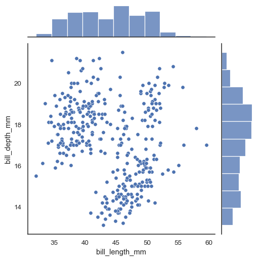
In the simplest invocation, assign
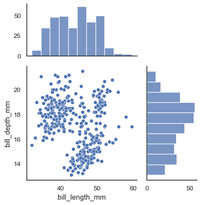
xandyto create a scatterplot (usingscatterplot()) with marginal histograms (usinghistplot()):penguins = sns.load_dataset("penguins") sns.jointplot(data=penguins, x="bill_length_mm", y="bill_depth_mm")
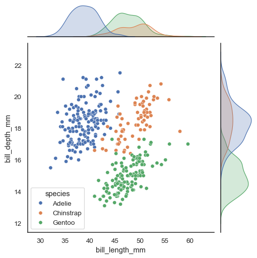
Assigning a
huevariable will add conditional colors to the scatterplot and draw separate density curves (usingkdeplot()) on the marginal axes:sns.jointplot(data=penguins, x="bill_length_mm", y="bill_depth_mm", hue="species")
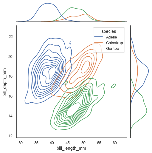
Several different approaches to plotting are available through the
kindparameter. Settingkind="kde"will draw both bivariate and univariate KDEs:sns.jointplot(data=penguins, x="bill_length_mm", y="bill_depth_mm", hue="species", kind="kde")
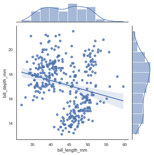
Set
kind="reg"to add a linear regression fit (usingregplot()) and univariate KDE curves:sns.jointplot(data=penguins, x="bill_length_mm", y="bill_depth_mm", kind="reg")
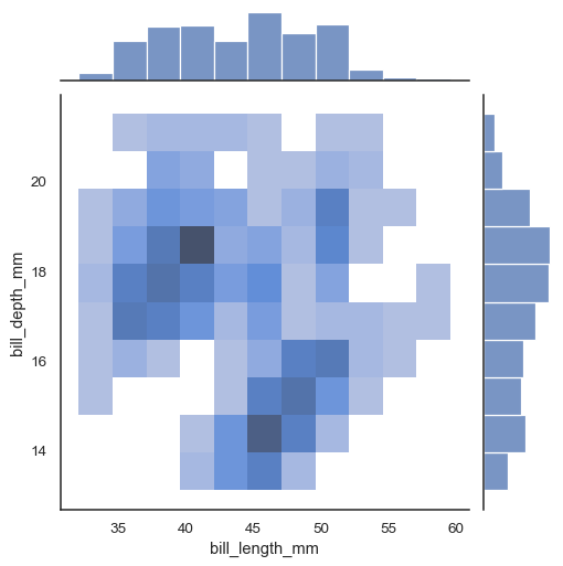
There are also two options for bin-based visualization of the joint distribution. The first, with
kind="hist", useshistplot()on all of the axes:sns.jointplot(data=penguins, x="bill_length_mm", y="bill_depth_mm", kind="hist")
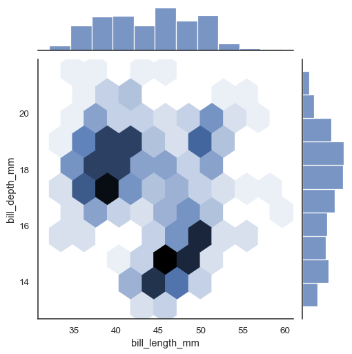
Alternatively, setting
kind="hex"will usematplotlib.axes.Axes.hexbin()to compute a bivariate histogram using hexagonal bins:sns.jointplot(data=penguins, x="bill_length_mm", y="bill_depth_mm", kind="hex")
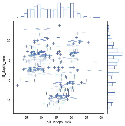
Additional keyword arguments can be passed down to the underlying plots:
sns.jointplot(
    data=penguins, x="bill_length_mm", y="bill_depth_mm",
    marker="+", s=100, marginal_kws=dict(bins=25, fill=False),
)
Use
JointGridparameters to control the size and layout of the figure:sns.jointplot(data=penguins, x="bill_length_mm", y="bill_depth_mm", height=5, ratio=2, marginal_ticks=True)
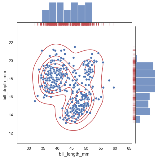
To add more layers onto the plot, use the methods on the
JointGridobject thatjointplot()returns:g = sns.jointplot(data=penguins, x="bill_length_mm", y="bill_depth_mm") g.plot_joint(sns.kdeplot, color="r", zorder=0, levels=6) g.plot_marginals(sns.rugplot, color="r", height=-.15, clip_on=False)